
Tips for Selecting the Right White Paint Color and How to Use Them
With all the white paint colors out there, we do have some of our tried and true favorites that we start with as a baseline when meeting with our clients. Here are our top 5 favorite white paint colors.
In the world of interior design, few decisions are as seemingly simple yet surprisingly complex as choosing the right white paint color. While white may appear to be a straightforward choice, the reality is that there exists a vast array of whites, each with its own unique undertones, nuances, and effects on a space. As an interior design firm, we understand the importance of selecting the perfect white paint color to enhance the beauty and atmosphere of your living or working space. In this blog post, we delve into the intricacies of white paint selection, offering insights and tips to help you make an informed decision.
Understanding the Diversity of White
Contrary to popular belief, not all white paints are the same. In fact, the spectrum of white paint colors is incredibly diverse, ranging from warm, creamy tones to cool, crisp shades. Understanding the underlying undertones of white paint is essential for achieving the desired aesthetic in your space.
Warm Whites: Warm white paints often contain subtle hints of yellow, red, or brown undertones, creating a cozy and inviting atmosphere. These shades pair beautifully with traditional or rustic interior styles, adding a sense of warmth and character to any room.
Cool Whites: On the other end of the spectrum, cool white paints feature undertones of blue, green, or gray, imparting a clean and contemporary feel to a space. These shades are ideal for modern or minimalist interiors, offering a refreshing and serene backdrop for your décor.
Neutral Whites: Situated between warm and cool tones, neutral white paints strike a perfect balance, making them incredibly versatile and adaptable to various design styles. These shades are excellent for creating a timeless and harmonious ambiance, allowing your furnishings and accessories to take center stage.
Tips for Selecting the Right White Paint Color
Consider Natural Light: The amount of natural light in your space can significantly influence how white paint appears. Rooms with ample sunlight may benefit from cooler white tones to prevent the space from feeling too harsh, while rooms with limited natural light may benefit from warmer whites to add warmth and depth.
Test Paint Samples: Before committing to a white paint color, it's essential to test samples in your space under different lighting conditions. Paint swatches directly onto your walls and observe how the color changes throughout the day, from morning light to evening shadows.
Complement Your Décor: Take into account the existing furnishings, fabrics, and finishes in your space when selecting a white paint color. Choose a shade that harmonizes with your décor elements, whether it's enhancing the warmth of wooden furniture or accentuating the sleekness of metal accents.
Consult with Professionals: When in doubt, seek guidance from experienced interior designers or paint experts who can offer personalized recommendations based on your specific needs and preferences. They can help navigate the myriad options available and steer you towards the perfect white paint color for your project.
With all the white paint colors out there, we do have some of our tried and true favorites that we start with as a baseline when meeting with our clients. Here are our top 5 favorite white paint colors.
Our Top 5 Favorite White Paint Colors
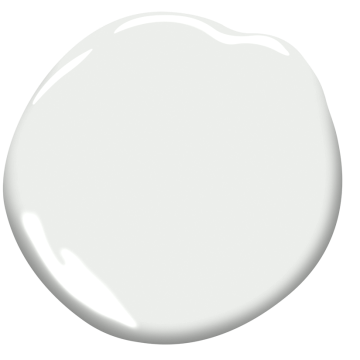
Benjamin Moore: Super White
Why we love it: It’s a bright and crisp neutral white that doesn’t have undertones of any other hues. We love using this white on kitchen cabinets to create a light and airy effect.

Benjamin Moore: Super white

Benjamin Moore: NARRAGANSET GREEN

Designed by: Sarah Jacquelyn Interiors | Photography by: Dustin Halleck
Benjamin Moore: Dove Wing
Why we love it: A creamy, warm white with undertones of gray and yellow. This color pairs well with darker grays and nicely brings out the purple tones of Benjamin Moore Stone.

Designed by: Sarah Jacquelyn Interiors

Benjamin Moore: Dove Wing

Benjamin Moore: stone
Benjamin Moore: Chantilly Lace
Why we love it: Delicate like lace, this white is soft, clean, and works with almost any other color! We love using it on doors, decorative trims, and fireplace mantels.

Benjamin Moore: Chantilly lace

Photo Credit: Benjamin moore
Benjamin Moore: OC 151
Why we love it: A subtly warm white that added freshness to the room without being to harsh. We love using this on ceilings!

Photo credit: benjamin moore

Benjamin Moore: OC-151
Benjamin Moore: Decorators White
Why we love it: A timeless, classic white with cool undertones. This white is great for walls!
Benjamin Moore: Decorators White

photo credit: benjamin moore
Embracing the Power of White Paint
In conclusion, the selection of white paint color is a multifaceted decision that requires careful consideration of undertones, lighting, and design aesthetics. By understanding the diverse range of white shades and following these tips for selection, you can harness the transformative power of white paint to elevate your space with timeless elegance and sophistication. Whether you're aiming for a cozy retreat or a contemporary haven, the perfect white paint color awaits to bring your vision to life.

Need help selecting paint colors, finishes, or environmentally friendly products?

It’s Time to Paint Your Front Door
Your front door is the first thing your guests see when they approach your home. It should prepare them for the beautiful interior that waits inside.
Updating the front of your home doesn’t need to break the bank. Sometimes a little paint, new door hardware, and some new lighting is all you need!
Your front door is the first thing your guests see when they approach your home. It should prepare them for the beautiful interior that waits inside.
Updating the front of your home doesn’t have to break the bank. Sometimes a little paint, new door hardware, and some new lighting is all you need!
The Design Challenge
Our client was looking to spruce up her front door entryway. The hardware finish was degraded, the paint was tired, and the lighting didn’t coordinate with the rest of her beautiful interior. We were challenged to update this front door with some new hardware, paint, and sconce lighting.


The Design Process
We started by taking influence from the stained glass motif. The square nature of the design influenced us to select square hardware and lighting. We went with a pewter metal finish for the hardware, as it coordinated with the metal in the stained glass. Matte black square lanterns completed the look.


Selecting a Paint Color
When selecting the front door paint color, we thought about the context of the whole home. The palette was rich and vibrant aqua and teal tones that balanced well with the neutrals. We used a lot of angled geometry, which also nicely tied in the rectangular design of the new door hardware and sconce lighting.


Benjamin Moore Aegean Teal
We finally landed on Benjamin Moore’s 2021 Color of The Year - Agean Teal as the paint color. It’s a beautiful blend of blue-green and gray. It’s an intriguing midtone that creates natural harmony; a balanced and soothing color that allows you to reflect and reset. It goes great with browns, taupe, chartreuse, and whites.
This welcoming color was perfect for the client’s front door.

The Reveal


Need help refreshing your front door? Schedule a design consultation today!

Our 5 Favorite Freestanding Bar Cabinets
If you’re not ready to take the plunge and commit to a built-in bar but are done storing your liquor and libations in the kitchen cabinets, then it’s time you meet the middle ground: a freestanding bar cabinet. Not only are bar cabinets completely practical, but they come in so many styles and designs to compliment your space and can add sophistication and intrigue.
If you’re not ready to take the plunge and commit to a built-in bar but are done storing your liquor and libations in the kitchen cabinets, then it’s time you meet the middle ground: a freestanding bar cabinet. Not only are bar cabinets completely practical, but they come in so many styles and designs to compliment your space and can add sophistication and intrigue.
Here are some of the freestanding bar cabinets we are loving right now!
Jonathan Adler: Torino Bar
Why we love it: This rich and moody cabinet elevates a space with a pop of color and polished brass details. We love the painted glass panels! It’s perfect for entertaining guest and a great conversation piece; what’s inside is just as exciting as what’s outside!


Restoration Hardware: Porthole Bar
Why we love it: Imagine how fun it would be to host a cocktail hour with this nautical-themed porthole bar! We love the 1920s inspired vibes. The mirrored interior keeps this iron sphere from feeling too heavy while still making a dramatic statement. This bar would go perfectly in a moody lounge.


Mitchell Gold + Bob Williams: Celine Bar Cabinet
Why we love it: This bar cabinet is so sleek and beautiful, showcasing an incredible richly textured faux leather. The black glass top and refined design details add another layer of sophistication. We love the mid-century modern influence!


Crate&Barrel: West Charcoal Cane Bar Cabinet
by Leanne Ford
Why we love it: Not only does this cabinet allow for tons of bar storage, but the dramatic size and interesting shape makes for a great statement piece! The woven cane and oak adds a natural element and so much texture. This cabinet is sure to add a lot of personality to any space.


Ballard Designs: Harper Campaign Bar
Why we love it: This cabinet is small, but mighty; it has so much storage and even comes with a pullout tray! We are in love with this rich blue color with the gold accents. It is just the right amount of modern design with traditional accents, making it the perfect transitional piece to suit any style.


Need help selecting the perfect freestanding bar cabinet for your home? Schedule a design consultation today!

River North Design District 6th Annual Gallery Walk
Join us Friday, September 10, 5PM-9PM and experience a vignette designed by Sarah Jacquelyn Interiors, inspired by the intriguing and emotional work of Bobbi Meier of salonb. at eggersmann.
Join us Friday, September 10, 5PM-9PM and experience a vignette designed by Sarah Jacquelyn Interiors, inspired by the intriguing and emotional work of Bobbi Meier of salonb. at eggersmann.

Click here to RSVP for the free showroom events
and to purchase tickets for the kickoff and after parties!

Our Favorite Decorative Hardware Right Now
Decorative hardware is the jewelry of the space! Whether you’re redesigning your entire home or just giving one of your rooms a refresh, use decorative hardware to add a little beauty and personality.
Decorative hardware is the jewelry of the space! Whether you’re redesigning your entire home or just giving one of your rooms a refresh, use decorative hardware to add a little beauty and personality.
Here are some of the pieces we are loving right now!
Modern Matter: Harrison Knob
Why we love it: It’s got texture, color, and character! We love adding metal accents to a make a design statement. Plus, it’s completely customizable; choose from eight gemstones and three different finishes. These vibrant colors are everything!


Modern Matter: Dogwood Custom Knob - Patina
Why we love it: This delicate looking flower adds a feminine and timeless touch to any furniture piece. While we absolutely love the patina, this knob is also available in three finishes and your choice of seven different semi-precious stones.


Modern Matter: Kravet Dylan Pull - Polished Brass
Why we love it: These pulls are sure to add luxurious vibes to any room. We love mixing metals into our designs and we are totally here for this polished brass.


AUZ Design Studio: Small Pyramid Square Knob
Why we love it: These modern square copper knobs add personality to any furniture piece. The finish is so unique and the textured lines on top are subtle and delicate.

Rocky Mountain Hardware: Emerald Cabinet Knob
Why we love it: This crafted hardware has exquisite detail with a handmade look. Perfect for kitchen cabinets in a traditional or transitional design.

Rejuvenation: Kennaston Drawer Pull
Why we love it: The sleek design of these pulls adds chic interest. We love the mix of leather and brass! These would be the perfect addition to a sophisticated kitchen.


Need help selecting the perfect decorative hardware for your home? Schedule a design consultation today!

Now Offering Premium E-Design Services
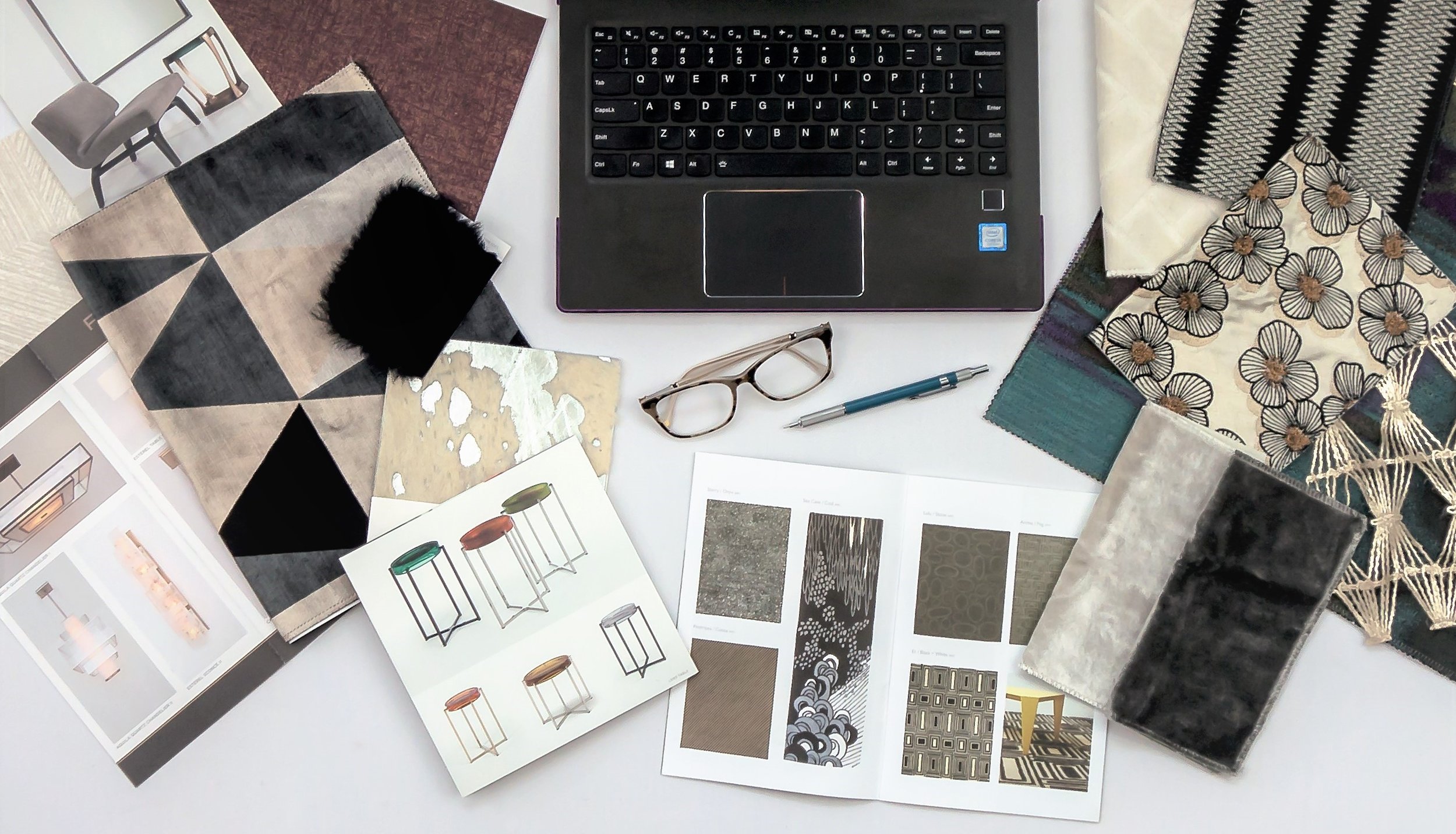
Our Premium E-Design is an online design-only service ideal for clients with a DIY spirit who have the time to manage some aspects of the project themselves, such as providing us with photos and measurements of the space.
Guess what?... Sarah Jacquelyn Interiors now offers Premium E-Design Service!
Our Premium E-Design is an online design-only service ideal for clients with a DIY spirit who have the time to manage some aspects of the project themselves, such as providing us with photos and measurements of the space.
What makes our Premium E-Design different?
Designer Room: You will still be working with a real professional interior designer.
Concept: We create and visualize the overall design concept.
Communication: Everything is handled either via email, video call or just by phone, no in-person meetings.
Sourcing: We source all the items for your home, just as we would with our full service client, but retail items only. This means a quicker turnaround time to get your project installed.
Customized Design Kit: You will receive a complete design kit in the mail which includes samples, printed copies of your design plan, mood boards, tear sheets, and a step-by-step implementation guide to execute the project yourself!
Quick Turnaround Time: SJI Premium E-Design offers a variety of rooms which are structured to be completed within 2-week timeline. If time is of highest priority for your project, this service can be a perfect fit!
Timeline and Budget: You implement the design on your own time and budget.
Collaboration: Premium E-Design service is still very much a collaboration between the client and designer. If there are specific pieces or family heirlooms you would like to incorporate in your design, we will work with you in exploring all possibilities.
DIY Attitude: Ideal service for clients who know what they like, have a DIY spirit, but just need some help pulling it all together to create a harmonious space.
Let’s Design Your Room: To sum it all up, Premium E-Design is a great way to get a designer room, in a quick turn around time, that you can implement on your own timeline and budget.
How It Works:
Discovery Phone Call: Book a free 30 minute Discovery Call with us to determine if your project is a good fit for Premium E-Design!
Homework: Follow our simple how-to guide with instructions for measuring and photographing your home.
Virtual House Tour: We’ll do a deep dive interview to get to know you and video tour your home.
Mood Board: We’ll email you a mood board and basic furniture layout for your approval to make sure we’re heading in the right design direction.
Design Time: Give us a few weeks to put your custom design together based on your style, budget, and needs.
Receive your Design Kit in the Mail: You will receive your custom design package in the mail with easy instructions to put the room together! What’s included:
Furniture Plans: Printed to scale and easy to read.
Design Board: A collage of all the elements we have selected for your new space, including furniture, accessories, lighting, and more!
Shopping Guide: Includes product details and how to purchase.
Material Samples: Such as wallpaper and fabric samples, paint colors, wood finishes, etc.
Design Review Video Call: We’ll walk you through the content of your Premium E-Design Package on a virtual video call! You’ll provide feedback and we will make reselections if there is anything you do not completely love.
Installation: Purchase product on your own timeline.
Bonus Follow Up Call: Jump on a complimentary 1 hour video call with us anytime over the next 2 months if you have questions about the design and implementation.


our top 5 favorite white paint colors and how to use them
With all the white paint colors out there, we do have some of our tried and true favorites that we start with as a baseline when meeting with our clients. Here are our top 5 favorite white paint colors.
People often ask us “What’s the perfect white paint color?” This is a difficult question to answer, because it really depends on your space, surrounding elements, lighting, and the design goals you are trying to achieve. Paint color should be the LAST element you select in your design. There are thousands of paint color options out there, and they vary by hue (color), value (lightness to darkness by adding black or white), and intensity (brightness or dullness by adding the complement color). Whites are particularly tricky because they often have undertones of blue, green, yellow, and red that can affect the look of your space.
Picking the perfect paint color takes a trained eye to understand all of the elements in the space and how they work together harmoniously. So I like to rephrase this question to:“ What is the perfect white paint color for your space?”
With all the white paint colors out there, we do have some of our tried and true favorites that we start with as a baseline when meeting with our clients. Here are our top 5 favorite white paint colors.
Benjamin Moore: Super White
Why we love it: It’s a bright and crisp neutral white that doesn’t have undertones of any other hues. We love using this white on kitchen cabinets to create a light and airy effect.
Benjamin Moore: Super white
Benjamin Moore: NARRAGANSET GREEN
Designed by: Sarah Jacquelyn Interiors | Photography by: Dustin Halleck
Benjamin Moore: Dove Wing
Why we love it: A creamy, warm white with undertones of gray and yellow. This color pairs well with darker grays and nicely brings out the purple tones of Benjamin Moore Stone.
Designed by: Sarah Jacquelyn Interiors
Benjamin Moore: Dove Wing
Benjamin Moore: stone
Benjamin Moore: Chantilly Lace
Why we love it: Delicate like lace, this white is soft, clean, and works with almost any other color! We love using it on doors, decorative trims, and fireplace mantels.
Benjamin Moore: Chantilly lace
Photo Credit: Benjamin moore
Benjamin Moore: OC 151
Why we love it: A subtly warm white that added freshness to the room without being to harsh. We love using this on ceilings!
Photo credit: benjamin moore
Benjamin Moore: OC-151
Benjamin Moore: Decorators White
Why we love it: A timeless, classic white with cool undertones. This white is great for walls!
Benjamin moore: Decorators White
photo credit: benjamin moore
Need help selecting the perfect paint colors for your space? Schedule a 2 Hour Paint Consultation with us today!

What’s in Your Paint?
Paint is paint, right? Why pay more for the same color? Not all paint is created equal and good quality paint comes at a price. Let’s dive into what really goes into a high quality can of paint that makes it worth the extra money.
It’s no secret that I love color! On the floor, furniture, and walls, I love working with my clients to get just the right balance that reflects who they are and makes them feel at home! Paint is one of the easiest and most cost effective ways to change the mood of your home or office. Aside from picking a stunning new color, there are many other factors to consider before breaking out the rollers. The finish, brand of paint, product line, environmental impact, and the health and safety of your family should all be considerations. Not all paint is created equal. So what’s the difference? Paint is paint right? Why pay more for the same color?
Good quality paint comes at a price. Let’s dive into what really goes into a can of paint to make it worth it. There are four main components in a gallon of paint: pigments, liquids, additives, and binders.

Pigment
Pigments are the finely ground particles that impact hide and color. There are two types of pigments that go into a can of paint. The first and most important are the prime pigments, they provide color and hide. The second are extender pigments, they add bulk to the paint, but do not really affect the color. Higher quality paints have more prime pigments providing an easier application, increased durability, and better color retention.
Liquids
The liquid is the carrier that helps get the paint from the can onto the wall. The liquid itself does not affect the quality of the paint, but rather the ratio of liquid to pigments and binders is what makes a top quality paint. The greater the ratio of solids to liquids, the higher quality the paint.
Additives
Additives are the extra ingredients that give a paint it’s specific performance characteristics differentiating from one paint to the next. Common additives in higher-quality paints include: Increased leveling agents to make the application process easier, microbicidal and anti microbial technology, preservatives to prevent spoilage, oder eliminating technology, and many more.
Binders
Binders provide adhesion and resistance to cracking, blistering and peeling. Latex paints use 100% acrylic, styrene-acrylic, or vinyl acrylic as a binder, while oil based based typically contain modified oils called alkyds like linseed oil and soya oil. The type, quality and quantity of binder affect everything including stain resistance, gloss, adhesion and crack resistance. Higher quality binders adhere to surfaces better and provide longer lasting performance.

BenjaminMoore.com

VOC’s and Paint
You probably know your breathing in chemicals when you smell a freshly painted room, but how bad can they be? What your smelling is VOC’s (volatile organic compounds), carbon-containing compounds that vaporize into the air. Once they enter the air, they react with other elements to create ozone, which causes air pollution and health problems. You may experience breathing problems, burning or itchy eyes, headaches and nausea. VOC’s are a even linked to certain cancers. VOC’s are found in many building materials, including paint.
The specific VOC’s in each paint vary by each manufacturer. It’s hard to know if your product contains VOC’s, as the manufacturer is not required to reveal all ingredients in their product. Most colorants will add VOC’s to the finished product, even paints that are formulated to be zero VOC don’t always maintain that level when it comes time for application. Federal VOC limits are currently set at 250 grams per liter (g/l) for flat paints and 380 g/l for others, but this can vary state to state. Low-VOC is usually 50 g/l or less and no-VOC is usually 5 g/l or less.
There numbers are for the base coating, adding colorant adds VOC’s to the base, and the person mixing the paint is not going to be able to tell you how much more was added. Typically the darker the color, the higher the VOC’s. Fortunately, there are innovative color technologies available now that won’t add any VOC content when adding pigment.
Benjamin Moore
Benjamin Moore and Sherwin Williams have both created Zero VOC paint formulas that don’t add any VOC’s to the paint even after adding colorant. Benjamin Moore’s no VOC technology is called Gennex.
“When we launched Gennex, we were the first company in the U.S. to introduce a zero-VOC (Volatile Organic Compounds) waterborne tinting system. The innovation of Gennex enables our zero-VOC paints to remain zero-VOC even after being tinted with Gennex colorants, an impossibility with generic, all-purpose colorant.
Gennex is a testament to Benjamin Moore’s dedication to meet or exceed the most stringent environmental standards. With over 3,500 colors, you can pick the exact color you need, and know you’ve been environmentally responsible with each and every one of them.” (BenjaminMoore.com)
Need More Help?
Not all paint is the same. Make a conscious effort for your families health by choosing a high quality paint and doing your research on it’s environmental impact.
Need help selecting paint colors, finishes, or environmentally friendly products? Schedule a consultation today! No project too big or small, I love helping my clients specify the perfect color for their foyer, living room, or office!


Beyond the Color Wheel: Indigo
Indigo, the color of elegance, strength and wonder. It can stimulate clear thinking and captivates the imagination.
Indigo, the color of elegance, strength and wonder. It can stimulate clear thinking and captivates the imagination. Indigo is a dramatic color that creates a bold impact. Don’t be afraid to use a dark color in a small space. Indigo is a great choice for a powder room. It adds a richness and creates a cozy environment that is sure to wow your guests. Indigo also emits feelings of luxury, making it a great choice for a library, bar, entry or formal living room.

Photo Credit: @rededition
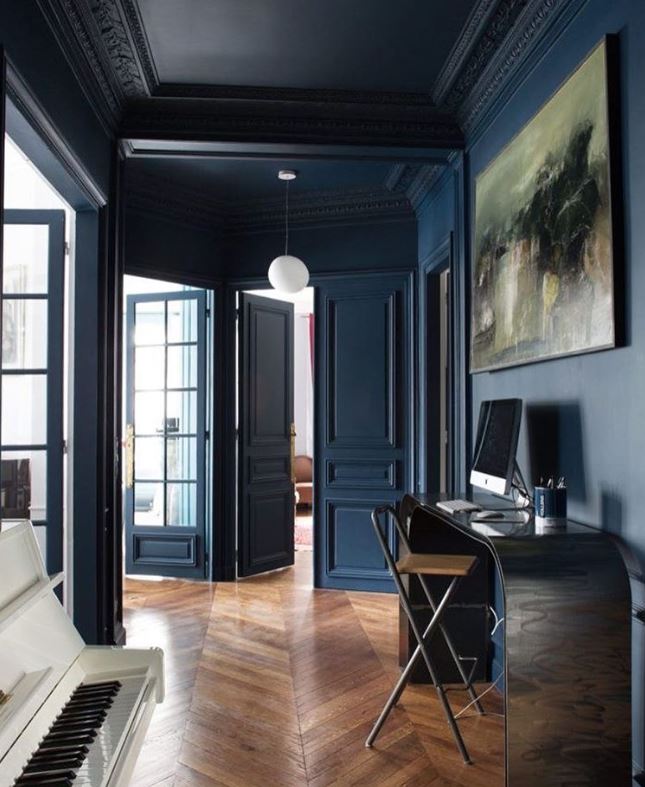
Photo Credit: @volcanod
While we see and use color in our everyday lives, rarely do we think about how that color has come to be. Indigo has an interesting history from being harvested as a natural dye, to the synthetic reproduction in the late 1800s and even it’s discovery on the color spectrum.
The history of indigo dates back to 4000 BC in what is now modern day Peru. The color indigo is named after the dye that is derived from the Indigofera Tinctoria plant. Though the complicated process has been modernized by machines, creating natural indigo dye is incredibly cumbersome.

“First the greenery was fermented in an alkaline solution. The liquid was then drawn off and vigorously beaten to aerate it. This caused a blue sediment to form, which was then dried into cakes or blocks to be sent off to market.” (The Secret Lives of Color)


Photo Credit: ayafiberstudio.com
In the 1660’s, Isaac Newton discovered that indigo was one of the seven base colors. He projected a beam of sunlight through a prism to create the rainbow,
“The...primary colours are, Red, Yellow, Green, Blew, and a Violet-purple, together with Orange, Indico, and an indefinite variety of Intermediate gradations.”

Culturally, indigo is found in the burial customs of many cultures. The ancient Egyptians dyed the edge of their burial linens with indigo. In fact, most of the Tutankhamun’s wardrobe was indigo.

Blue Kerchief from Tutankhamun's Embalming Cache
Today, most indigo dye is synthetic. Indigo was first synthesized by Adolph von Bayer, who identified the molecular structure of natural indigo and recreated it in a lab. This allowed indigio to be made on demand. Synthetic dye is more durable and does not lose its pigmentation as quickly over time. Most commercial denim is made using synthetic indigo. Though synthetic indigo is more readily available and cheaper, it does not have the same quality and depth as natural indigo.

Whether synthetic or natural, indigo is not going anyway where. This thousand year old color maintains its appeal in interior design, art, textiles and fashion.

Bonus fact: It was discovered in 2008, that when a banana becomes ripe, they glows indigo under a blacklight. This allows animals who see ultraviolet to know when a banana is ripe and ready to eat.
