Sherwin-William's Color of the Year 2023
Sherwin-Williams just revealed it’s Color of the Year for 2023: Redend Point SW9081. The blush-beige undertones in Redend Point bring a sense of calm and warmth to a space, making it such a versatile color choice. Sherwin-Williams describes Redend Point as a “minimal, calming, and intriguing.” As a part of their Colormix® Forecast for 2023, Redend Point is one shade you can find in TERRA—a collection of hues that “embrace regeneration, creativity, care, connection, and joy.” Here’s what we think of the new Color of the Year!

SHERWIN WILLIAMS

Redend Point SW9081 - Sherwin-Williams
Why We Love It!
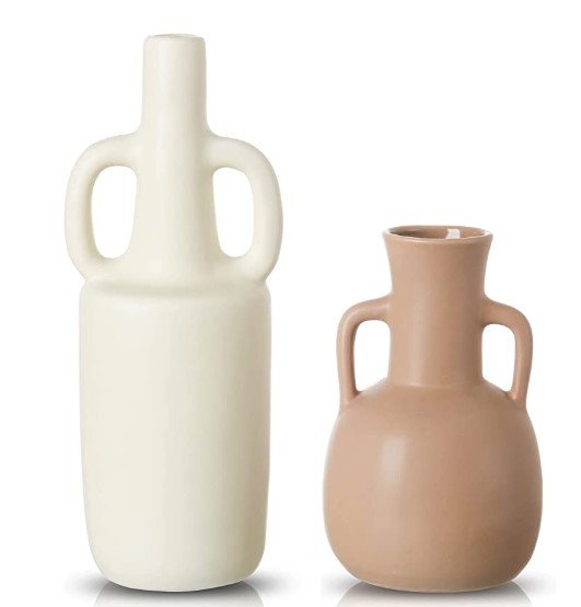
Redend Point is neutral enough to use in any room with the right compliments. The earthy, cozy color makes a room feel inviting and grounded at the same time. The new-age neutral brings in a pop of color that traditional whites or eggshells lack, which makes it the perfect choice for those with a minimalist style who are desiring something new.
Redend Point is a natural transition from the classic neutrals we have been seeing the last decade as homeowners are moving towards warmer whites, beiges, pinks, and browns.

SHERWIN WILLIAMS
"Redend Point was inspired by the idea of finding beauty beyond ourselves. It is a heartening hue that invites compassion and connection into any space. The color is a natural choice for those looking for a warm and joyful neutral in both interiors and exteriors." - Sue Wadden, director of color marketing at Sherwin-Williams

SHERWIN WILLIAMS