


Tips for Selecting the Right White Paint Color and How to Use Them
With all the white paint colors out there, we do have some of our tried and true favorites that we start with as a baseline when meeting with our clients. Here are our top 5 favorite white paint colors.
In the world of interior design, few decisions are as seemingly simple yet surprisingly complex as choosing the right white paint color. While white may appear to be a straightforward choice, the reality is that there exists a vast array of whites, each with its own unique undertones, nuances, and effects on a space. As an interior design firm, we understand the importance of selecting the perfect white paint color to enhance the beauty and atmosphere of your living or working space. In this blog post, we delve into the intricacies of white paint selection, offering insights and tips to help you make an informed decision.
Understanding the Diversity of White
Contrary to popular belief, not all white paints are the same. In fact, the spectrum of white paint colors is incredibly diverse, ranging from warm, creamy tones to cool, crisp shades. Understanding the underlying undertones of white paint is essential for achieving the desired aesthetic in your space.
Warm Whites: Warm white paints often contain subtle hints of yellow, red, or brown undertones, creating a cozy and inviting atmosphere. These shades pair beautifully with traditional or rustic interior styles, adding a sense of warmth and character to any room.
Cool Whites: On the other end of the spectrum, cool white paints feature undertones of blue, green, or gray, imparting a clean and contemporary feel to a space. These shades are ideal for modern or minimalist interiors, offering a refreshing and serene backdrop for your décor.
Neutral Whites: Situated between warm and cool tones, neutral white paints strike a perfect balance, making them incredibly versatile and adaptable to various design styles. These shades are excellent for creating a timeless and harmonious ambiance, allowing your furnishings and accessories to take center stage.
Tips for Selecting the Right White Paint Color
Consider Natural Light: The amount of natural light in your space can significantly influence how white paint appears. Rooms with ample sunlight may benefit from cooler white tones to prevent the space from feeling too harsh, while rooms with limited natural light may benefit from warmer whites to add warmth and depth.
Test Paint Samples: Before committing to a white paint color, it's essential to test samples in your space under different lighting conditions. Paint swatches directly onto your walls and observe how the color changes throughout the day, from morning light to evening shadows.
Complement Your Décor: Take into account the existing furnishings, fabrics, and finishes in your space when selecting a white paint color. Choose a shade that harmonizes with your décor elements, whether it's enhancing the warmth of wooden furniture or accentuating the sleekness of metal accents.
Consult with Professionals: When in doubt, seek guidance from experienced interior designers or paint experts who can offer personalized recommendations based on your specific needs and preferences. They can help navigate the myriad options available and steer you towards the perfect white paint color for your project.
With all the white paint colors out there, we do have some of our tried and true favorites that we start with as a baseline when meeting with our clients. Here are our top 5 favorite white paint colors.
Our Top 5 Favorite White Paint Colors
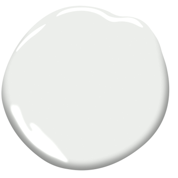
Benjamin Moore: Super White
Why we love it: It’s a bright and crisp neutral white that doesn’t have undertones of any other hues. We love using this white on kitchen cabinets to create a light and airy effect.

Benjamin Moore: Super white

Benjamin Moore: NARRAGANSET GREEN

Designed by: Sarah Jacquelyn Interiors | Photography by: Dustin Halleck
Benjamin Moore: Dove Wing
Why we love it: A creamy, warm white with undertones of gray and yellow. This color pairs well with darker grays and nicely brings out the purple tones of Benjamin Moore Stone.

Designed by: Sarah Jacquelyn Interiors

Benjamin Moore: Dove Wing

Benjamin Moore: stone
Benjamin Moore: Chantilly Lace
Why we love it: Delicate like lace, this white is soft, clean, and works with almost any other color! We love using it on doors, decorative trims, and fireplace mantels.

Benjamin Moore: Chantilly lace

Photo Credit: Benjamin moore
Benjamin Moore: OC 151
Why we love it: A subtly warm white that added freshness to the room without being to harsh. We love using this on ceilings!

Photo credit: benjamin moore

Benjamin Moore: OC-151
Benjamin Moore: Decorators White
Why we love it: A timeless, classic white with cool undertones. This white is great for walls!
Benjamin Moore: Decorators White

photo credit: benjamin moore
Embracing the Power of White Paint
In conclusion, the selection of white paint color is a multifaceted decision that requires careful consideration of undertones, lighting, and design aesthetics. By understanding the diverse range of white shades and following these tips for selection, you can harness the transformative power of white paint to elevate your space with timeless elegance and sophistication. Whether you're aiming for a cozy retreat or a contemporary haven, the perfect white paint color awaits to bring your vision to life.

Need help selecting paint colors, finishes, or environmentally friendly products?

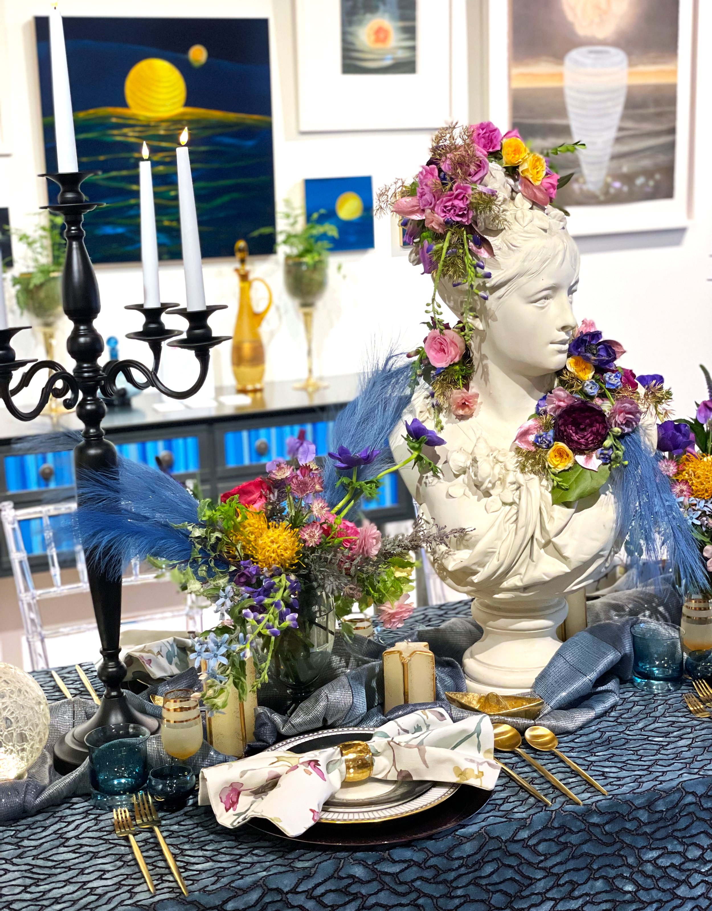
The Art of Dining: A Tablescape Inspired by the Art of Christina Haglid
Swaying with the ocean’s breath, illuminated orbs dance over translucent waves. Nighttime flowers blossom under moonlight. Peace washes over as glimmering stars brighten the endless midnight sky. Inspired by Christina Haglid’s ethereal artwork, Sarah Jacquelyn Interiors sets the space between light and dark.

Our team had the honor of participating in ASID Illinois inaugural Art of Dining event this year!
12 talented interior designers created beautiful tablescapes that were inspired by the art of: René Romero Schuler, Christina Haglid, Steve Turner, Mark Bowers & Jeff Conroy. The event was hosted at Gallery Victor Armendariz and Zola Lieberman Gallery in River North.

Sarah Jacquelyn Interiors was inspired by Christina Haglid’s ethereal artwork.
The fragility of the environment has always played an important role in Christina Haglid's work. As a child growing up on the East Coast, the ever changing seaside landscapes intrigued her. This fragile balance between nature and her subject matter is as delicate as a paper lantern floating on the ocean.

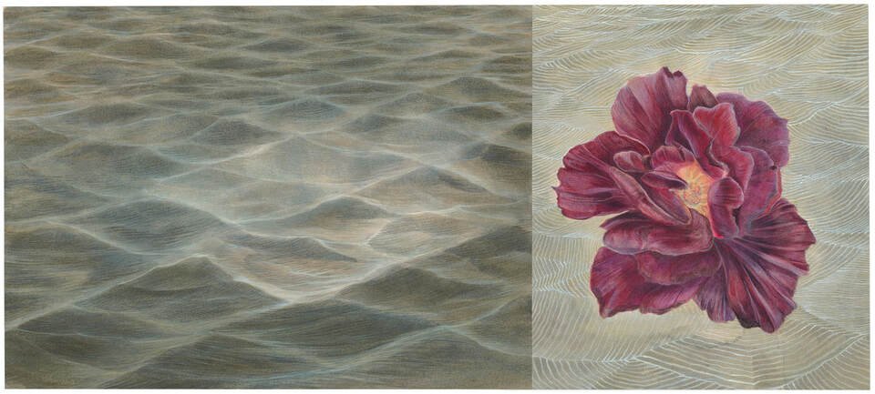
The Ocean, Christina Haglid 2019 - 2020, acrylic on panel, 8h x 10w inches
Christina Haglid’s history with writing poetry has shaped the narrative process in her artwork. She views objects in the painting like words placed on a page. Haglid creates her paintings with watercolor and gouache on paper or acrylic on panel. She composes flowers, manipulated objects, and architecture together in compositions to symbolize the subtle conversations and interactions between them. Her imagery is placed in imaginary landscapes that are inspired by actual places seen throughout her travels.

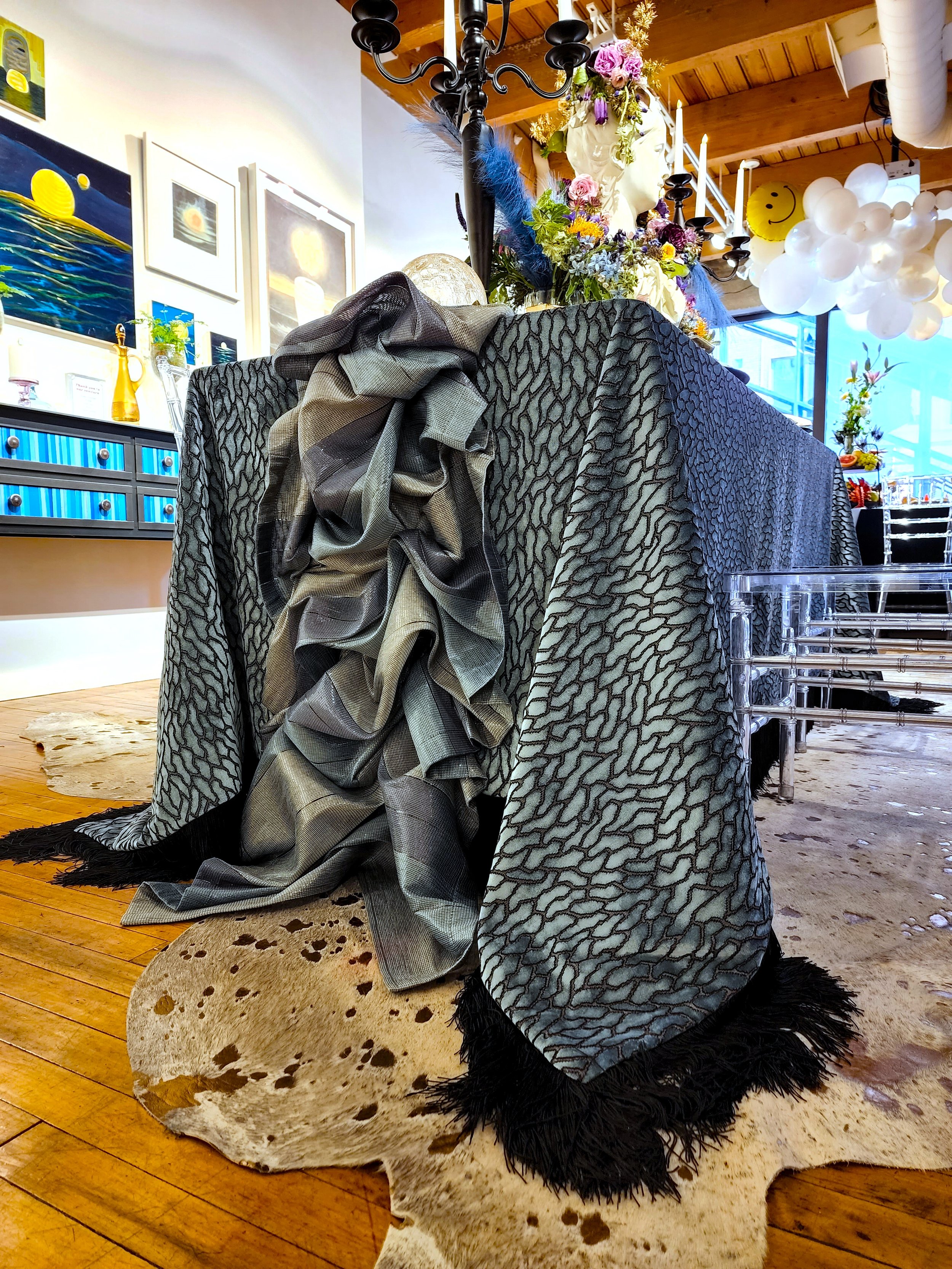
Each tablescape highlighted a color from Sherwin Williams, one of the event sponsors. Our vignette incorporated the beautiful color: Smokey Blue

Smoky Blue by Sherwin Williams

Petunia in Space, Christina Haglid, 2018, watercolor and gouache on paper, 5.25h x 5w inches
“At the heart of my work is the recurring depiction of perseverance, strength of will, and a subtle optimism. Symbolically through the objects, precarious situations depict a moment of possible difficulty, often involving the influence of nature.”

Paper Boat, Christina Haglid, 2019 - 2020, acrylic on panel, 8h x 10w inches

Monolith No. 4, Sarah Haglid, 2020, watercolor and gouache on paper, 8h x 9w inches
Daybreak, Christina Haglid, 2015-2018, watercolor and gouache on paper, 7.88h x 14.50w inches
Swaying with the ocean’s breath, illuminated orbs dance over translucent waves. Nighttime flowers blossom under moonlight. Peace washes over as glimmering stars brighten the endless midnight sky. Inspired by Christina Haglid’s ethereal artwork, Sarah Jacquelyn Interiors sets the space between light and dark.

What inspired us:
mysterious and spiritual quality
movement vs. calm nature of water
layers of ocean moving at night
juxtaposition of light and dark
floating quality of the orbs, glowing flowers
glowing effect of organic objects
story of the object and its environment
We used color and a 3D fabric texture to evoke the feeling of the ocean at night. Generous florals adorn a feminine bust with a mysterious gaze. Droplets of gold accents float over the blue tablecloth, emulating the ocean. Glowing orbs dance over waves of fabric on each end of the table setting.

Thank you to everyone who came out to support us and a special thank you to all that made this tablescape possible. We couldn’t have done this without you!

The team, Sarah Jacquelyn Interiors

Need help designing the perfect table setting? Schedule a design consultation with our team today!

How to Design Your Living Room
Expert advice on how to design your living room.
1. First things first…paint last! It may seem counterintuitive, but with so many nuanced options, you'll want to get it just right. We used Benjamin Moore’s luscious ‘Galapagos Green’ in an ultra flat finish for the ceiling in our latest living room makeover. Be patient, and be bold!


Botanical Garden Living Room, Photo Credit Dustin Halleck

Best Specialty Art and Framing Project: ASID IL Design Excellence 2021, Photo Credit Dustin Halleck
2. Find your focal point. Every room has a natural center point, whether it's the fireplace, TV, or picture window with an expansive view. Plan furniture around this center line. Sometimes a room can have two focal points, like a TV wall and a fireplace. This is trickier, but with the right sectional, anything is possible. Art is one of my favorite focal points. A good frame makes the piece. Artists Frame Service is our favorite local framer. Art helps set the mood in the space, balances the weight of the room, adds color + texture, and creates a conversation starter.
Pro Tip: I love vacation art. These are special pieces picked up on your travels that bring you back to that time and place. Also, buy art done by family members, local artist’s pieces that speak to you, or try framing your own artwork!

Botanical Garden Living Room, Photo Credit Dustin Halleck
3. Select functional furniture. Opt for tight over loose cushions. You'll save yourself the trouble of constantly cleaning between the seats. Multifunctional furniture is great! Pull up ottomans on casters and add instant seating. Bonus if they cant be tucked away under a coffee table or console. Make sure there’s ample surfaces to live and function. Consider a console behind your sofa, end tables for a wine glass, or a coffee table 18-20" from the sofa edge.
4. Think about function & address traffic flow. Do you host super bowl parties and need seating for 8-10? Maybe the kids need it to be cozy, while you need it to be easy to clean. Perhaps it's just you, your partner, and your dog relaxing after a long day of work. Knowing how you will use the space will determine the direction of the design.
To find a flow, think about how you and your guests are entering and exiting this room. Are two points of entry needed? Does that point of entry cross the path of the TV? Can that be avoided?


Our Team: Violeta, Bianka, and Sarah (from Left to right)
5. Layer your lighting. Think ceiling lights, table lamps, floor lamps, and windows. Balance the light in the space. Make sure your lighting is on dimmers to adjust it has a day turns to night.
6. Bring in color. Start with the rug. Use the colors of the rug to influence the palette for the rest of the room. Your rug should be large enough that the front two feet of the sofa sit on it comfortably.
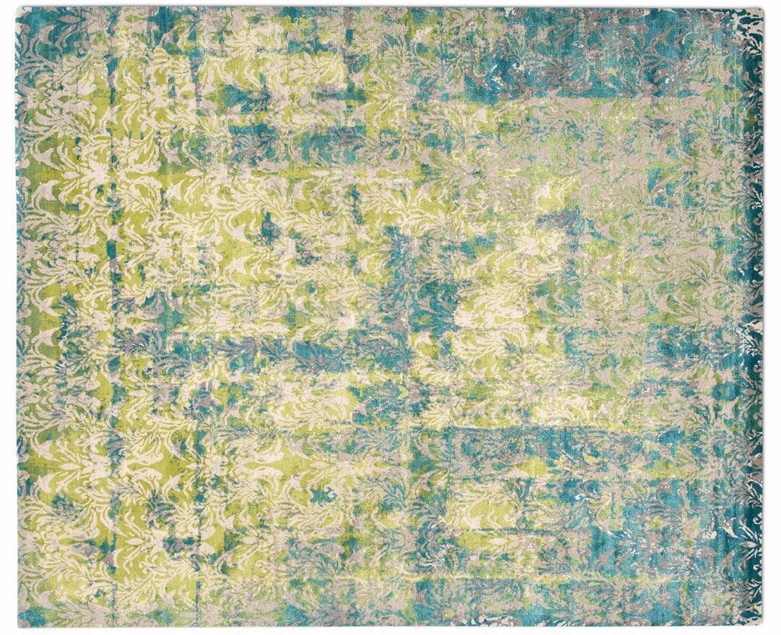
“Cover” by Knots Rugs, Sold Exclusively at Integral THread
7. Choose fabrics for your lifestyle. Busy living calls for stain treated or bleach cleanable fabrics depending on your needs (and how rowdy your guests get!) Cozy up with the final layer of pillows. Add in pattern, texture, and trim here. Have fun with it! These can be changed out seasonally or as you want to update your decor!

First Place winner of The Gallery Walk 2021, PHoto Credit Michael Kaskel.
Need help designing the perfect living room? Schedule a design consultation with our team today!

Our Favorite Decorative Hardware Right Now
Decorative hardware is the jewelry of the space! Whether you’re redesigning your entire home or just giving one of your rooms a refresh, use decorative hardware to add a little beauty and personality.
Decorative hardware is the jewelry of the space! Whether you’re redesigning your entire home or just giving one of your rooms a refresh, use decorative hardware to add a little beauty and personality.
Here are some of the pieces we are loving right now!
Modern Matter: Harrison Knob
Why we love it: It’s got texture, color, and character! We love adding metal accents to a make a design statement. Plus, it’s completely customizable; choose from eight gemstones and three different finishes. These vibrant colors are everything!


Modern Matter: Dogwood Custom Knob - Patina
Why we love it: This delicate looking flower adds a feminine and timeless touch to any furniture piece. While we absolutely love the patina, this knob is also available in three finishes and your choice of seven different semi-precious stones.


Modern Matter: Kravet Dylan Pull - Polished Brass
Why we love it: These pulls are sure to add luxurious vibes to any room. We love mixing metals into our designs and we are totally here for this polished brass.


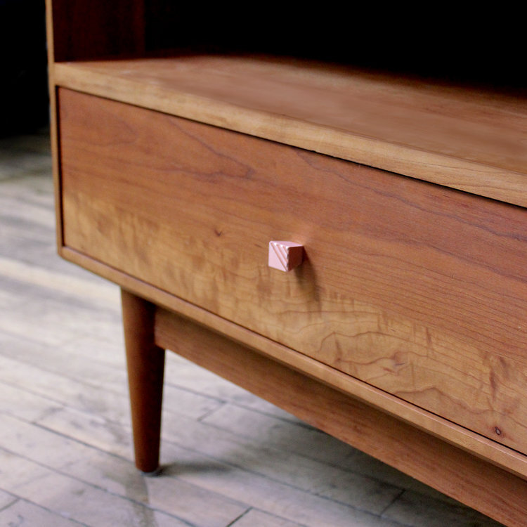
AUZ Design Studio: Small Pyramid Square Knob
Why we love it: These modern square copper knobs add personality to any furniture piece. The finish is so unique and the textured lines on top are subtle and delicate.

Rocky Mountain Hardware: Emerald Cabinet Knob
Why we love it: This crafted hardware has exquisite detail with a handmade look. Perfect for kitchen cabinets in a traditional or transitional design.

Rejuvenation: Kennaston Drawer Pull
Why we love it: The sleek design of these pulls adds chic interest. We love the mix of leather and brass! These would be the perfect addition to a sophisticated kitchen.


Need help selecting the perfect decorative hardware for your home? Schedule a design consultation today!

The Custom Framing Process
Go behind the scenes with SJI to see how we design custom frames for our clients.


Ready to start your framing project with us? Schedule a design consultation today!

our top 5 favorite white paint colors and how to use them
With all the white paint colors out there, we do have some of our tried and true favorites that we start with as a baseline when meeting with our clients. Here are our top 5 favorite white paint colors.
People often ask us “What’s the perfect white paint color?” This is a difficult question to answer, because it really depends on your space, surrounding elements, lighting, and the design goals you are trying to achieve. Paint color should be the LAST element you select in your design. There are thousands of paint color options out there, and they vary by hue (color), value (lightness to darkness by adding black or white), and intensity (brightness or dullness by adding the complement color). Whites are particularly tricky because they often have undertones of blue, green, yellow, and red that can affect the look of your space.
Picking the perfect paint color takes a trained eye to understand all of the elements in the space and how they work together harmoniously. So I like to rephrase this question to:“ What is the perfect white paint color for your space?”
With all the white paint colors out there, we do have some of our tried and true favorites that we start with as a baseline when meeting with our clients. Here are our top 5 favorite white paint colors.
Benjamin Moore: Super White
Why we love it: It’s a bright and crisp neutral white that doesn’t have undertones of any other hues. We love using this white on kitchen cabinets to create a light and airy effect.
Benjamin Moore: Super white
Benjamin Moore: NARRAGANSET GREEN
Designed by: Sarah Jacquelyn Interiors | Photography by: Dustin Halleck
Benjamin Moore: Dove Wing
Why we love it: A creamy, warm white with undertones of gray and yellow. This color pairs well with darker grays and nicely brings out the purple tones of Benjamin Moore Stone.
Designed by: Sarah Jacquelyn Interiors
Benjamin Moore: Dove Wing
Benjamin Moore: stone
Benjamin Moore: Chantilly Lace
Why we love it: Delicate like lace, this white is soft, clean, and works with almost any other color! We love using it on doors, decorative trims, and fireplace mantels.
Benjamin Moore: Chantilly lace
Photo Credit: Benjamin moore
Benjamin Moore: OC 151
Why we love it: A subtly warm white that added freshness to the room without being to harsh. We love using this on ceilings!
Photo credit: benjamin moore
Benjamin Moore: OC-151
Benjamin Moore: Decorators White
Why we love it: A timeless, classic white with cool undertones. This white is great for walls!
Benjamin moore: Decorators White
photo credit: benjamin moore