

Sherwin-Williams Colormix Forcast 2019
Every year, Sherwin-Williams releases a Colormix Forecast. They take “color of the year” above and beyond, with 6 distinct color palettes that have personality and emotion. After reading about each of them, let me know which palette you feel most connected to!
Every year, Sherwin-Williams releases a Colormix Forecast. They take “color of the year” above and beyond, with 6 distinct color palettes that have personality and emotion. I was able to get a sneak preview of these unique combinations last fall and I’m so excited to share them on my blog today. After reading about each of them, let me know which palette you feel most connected to!
Click below to watch the inspiration video:

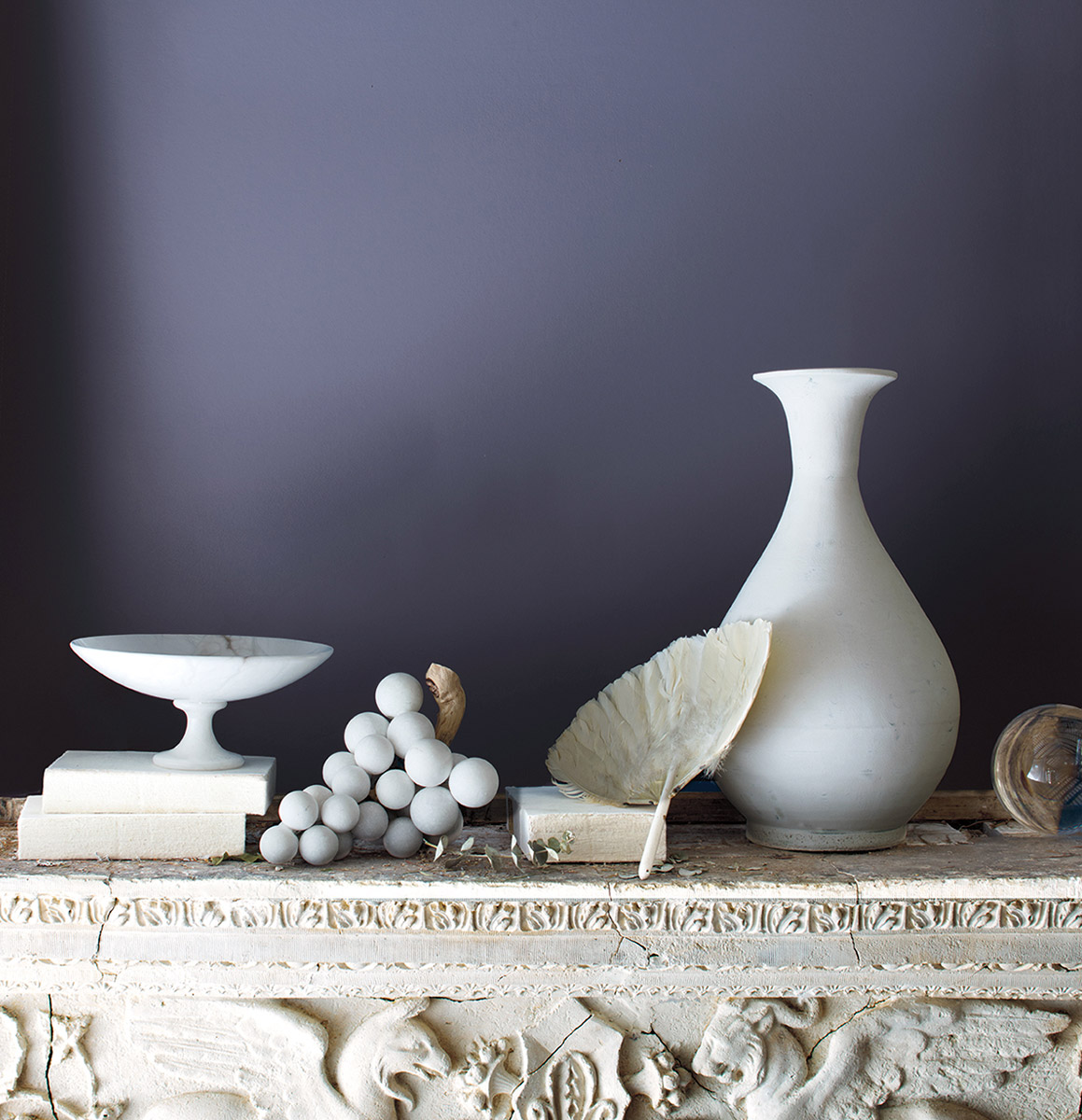
SHAPESHIFTER
“There are those who always seem a little ahead of their time. Visionary and creative, this palette reaches into the cosmos and returns with a whole universe of inspiration. Atmospheric wisps of colors, grounded by deep, dark blues, capture the unique space between technology and spirituality.” (swcolorforecast.com)
RINGS OF SATURN | ARTIFICIAL INTELLIGENCE | SPIRITUALISM | HEALING ENERGY


Shapeshifter is all about cool wood tones, iridescent finishes, metals and crystals.

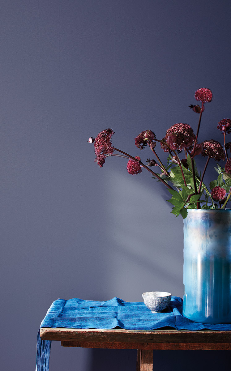
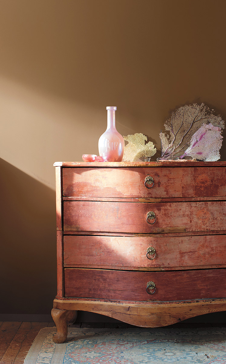
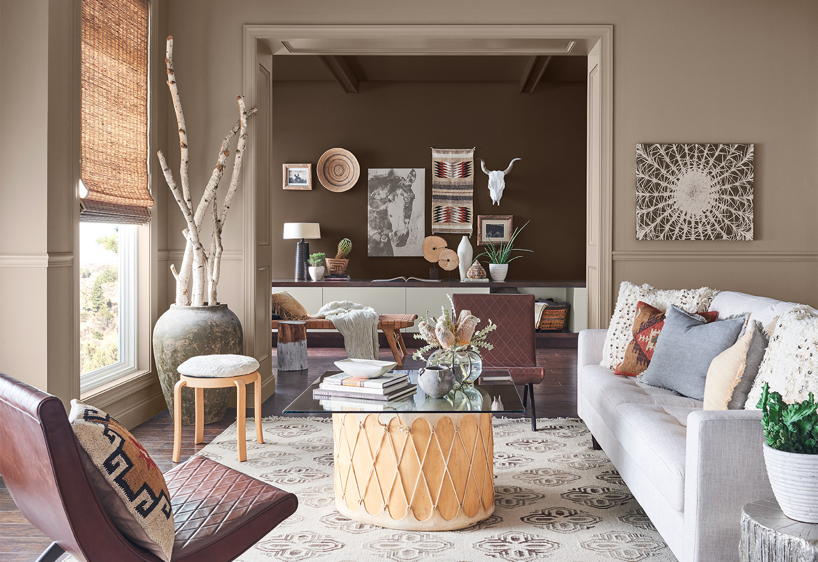
WANDERER
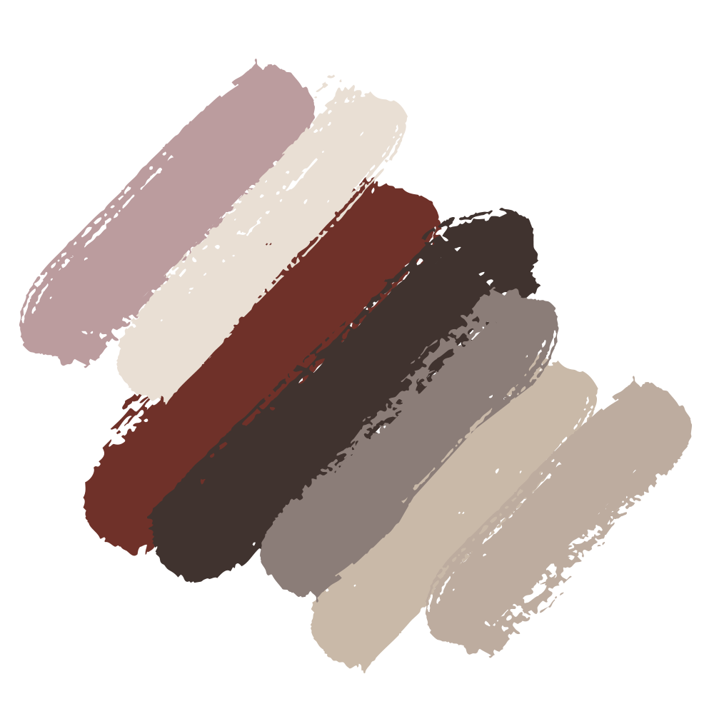
“Some spirits can never be fenced in. They need to soak in the blue of endless horizon and the subtle earthy colors of the high plains and desert. Sun-washed and warm, this palette can be seen in the baked clay canyons, worn leather and woven wool blankets of the true New West.” (swcolorforecast.com)
CAREFREE BOHEMIAN | MODERN COWGIRL | UNBRIDLED ADVENTURE | SOUTHWESTERN TWIST


Picture warm wool blankets, rustic warm wood tones, camel colored leathers. Think lots of natural materials, and sustainable living, the modern farm house. This palette moves away from the high gloss finishes and metallics.
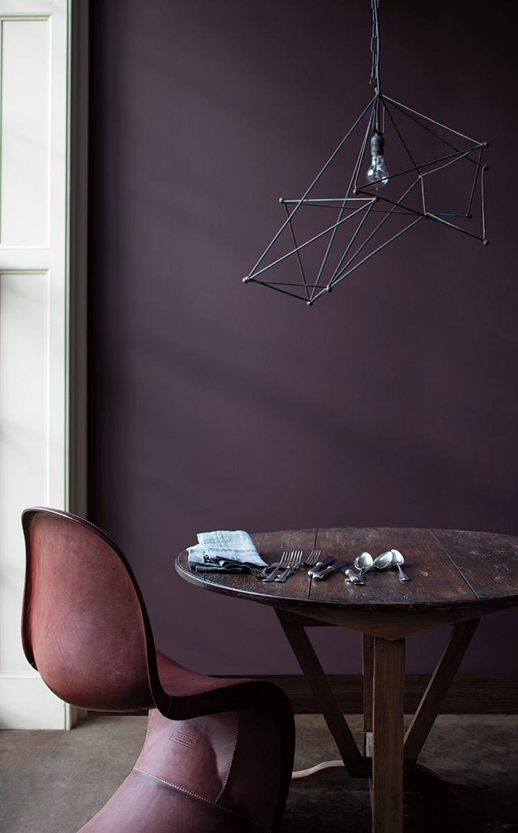
AFICIONADO
“Devotees of the best in life appreciate the well-worn, the bespoke and the rare. Like a bookcase of leather-bound classics, this polished palette evokes nostalgia and timeless tradition. With copper and gold anchored by merlot and deep, dark gray, these tailored tones make everything feel impeccable, tasteful and elegant.” (swcolorforecast.com)
READING NOOKS | BRITISH ACCENTS | TWEEDY MENSWEAR |'60S NOSTALGIA


Aficionado is all about mixing and matching styles and eras. Think warm modernism that is comfortable, yet contemporary. The epitome of the bibliophile.

ENTHUSIAST
“There are those who don’t know the meaning of “less is more.” Passionate and eclectic, they have a calling to be unique. They embrace the details and create scene-stealing worlds that burst with beauty. The proof is in this palette that features bold pops of vivid color, maximum impact and lots of energy.” (swcolorforecast.com)
MAXIMALISM | COZY CHAOS | OVER-THE-TOP OPULENCE | MORE IS MORE


Maximalism is on its’ way back! Think confident, bright colors that celebrate personality and self expression. Layered collages, mixed patterns and textures, and unique wood finishes set this palette apart.

NATURALIST
“Walking barefoot in the garden, nature lovers instantly connect with the wonder of the world in full bloom. With roots in the forest, this palette’s colorful tendrils grew in hothouses and conservatories until they became these lush, sophisticated tones. Ranging from mushroom to leafy green to passionate floral pink, they’ve now found a place where they’ll never fade.” (swcolorforecast.com)
FOREST MUSHROOMS | BOTANICAL PRINTS | BUTTERFLY COLLECTIONS | TERRARIUMS


Botanicals, terrariums, and intricate details, Naturalist is about bringing the outside in. Characterized by worn wood textures and layered plants, this palette is whimsical, yet crisp.

RACONTEUR
“From ancient sagas to today’s motivational speakers, we love our storytellers. With colorful accounts they sum up our very nature and remind us how we’re all connected. Passed from grandmothers, traders and nomads, the tales traveled the world, gaining artistry, until we’ve translated them into a rich and modern palette that spans space and time.” (swcolorforecast.com)
DESERT OASES | GLOBAL STYLE | LUXURY SAFARIS | SPICE MARKETS

Raconteur means story teller. Characterized by global influences and natural materials, this palette captures our attention and connects us through a design story.


What’s in Your Paint?
Paint is paint, right? Why pay more for the same color? Not all paint is created equal and good quality paint comes at a price. Let’s dive into what really goes into a high quality can of paint that makes it worth the extra money.
It’s no secret that I love color! On the floor, furniture, and walls, I love working with my clients to get just the right balance that reflects who they are and makes them feel at home! Paint is one of the easiest and most cost effective ways to change the mood of your home or office. Aside from picking a stunning new color, there are many other factors to consider before breaking out the rollers. The finish, brand of paint, product line, environmental impact, and the health and safety of your family should all be considerations. Not all paint is created equal. So what’s the difference? Paint is paint right? Why pay more for the same color?
Good quality paint comes at a price. Let’s dive into what really goes into a can of paint to make it worth it. There are four main components in a gallon of paint: pigments, liquids, additives, and binders.

Pigment
Pigments are the finely ground particles that impact hide and color. There are two types of pigments that go into a can of paint. The first and most important are the prime pigments, they provide color and hide. The second are extender pigments, they add bulk to the paint, but do not really affect the color. Higher quality paints have more prime pigments providing an easier application, increased durability, and better color retention.
Liquids
The liquid is the carrier that helps get the paint from the can onto the wall. The liquid itself does not affect the quality of the paint, but rather the ratio of liquid to pigments and binders is what makes a top quality paint. The greater the ratio of solids to liquids, the higher quality the paint.
Additives
Additives are the extra ingredients that give a paint it’s specific performance characteristics differentiating from one paint to the next. Common additives in higher-quality paints include: Increased leveling agents to make the application process easier, microbicidal and anti microbial technology, preservatives to prevent spoilage, oder eliminating technology, and many more.
Binders
Binders provide adhesion and resistance to cracking, blistering and peeling. Latex paints use 100% acrylic, styrene-acrylic, or vinyl acrylic as a binder, while oil based based typically contain modified oils called alkyds like linseed oil and soya oil. The type, quality and quantity of binder affect everything including stain resistance, gloss, adhesion and crack resistance. Higher quality binders adhere to surfaces better and provide longer lasting performance.

BenjaminMoore.com

VOC’s and Paint
You probably know your breathing in chemicals when you smell a freshly painted room, but how bad can they be? What your smelling is VOC’s (volatile organic compounds), carbon-containing compounds that vaporize into the air. Once they enter the air, they react with other elements to create ozone, which causes air pollution and health problems. You may experience breathing problems, burning or itchy eyes, headaches and nausea. VOC’s are a even linked to certain cancers. VOC’s are found in many building materials, including paint.
The specific VOC’s in each paint vary by each manufacturer. It’s hard to know if your product contains VOC’s, as the manufacturer is not required to reveal all ingredients in their product. Most colorants will add VOC’s to the finished product, even paints that are formulated to be zero VOC don’t always maintain that level when it comes time for application. Federal VOC limits are currently set at 250 grams per liter (g/l) for flat paints and 380 g/l for others, but this can vary state to state. Low-VOC is usually 50 g/l or less and no-VOC is usually 5 g/l or less.
There numbers are for the base coating, adding colorant adds VOC’s to the base, and the person mixing the paint is not going to be able to tell you how much more was added. Typically the darker the color, the higher the VOC’s. Fortunately, there are innovative color technologies available now that won’t add any VOC content when adding pigment.
Benjamin Moore
Benjamin Moore and Sherwin Williams have both created Zero VOC paint formulas that don’t add any VOC’s to the paint even after adding colorant. Benjamin Moore’s no VOC technology is called Gennex.
“When we launched Gennex, we were the first company in the U.S. to introduce a zero-VOC (Volatile Organic Compounds) waterborne tinting system. The innovation of Gennex enables our zero-VOC paints to remain zero-VOC even after being tinted with Gennex colorants, an impossibility with generic, all-purpose colorant.
Gennex is a testament to Benjamin Moore’s dedication to meet or exceed the most stringent environmental standards. With over 3,500 colors, you can pick the exact color you need, and know you’ve been environmentally responsible with each and every one of them.” (BenjaminMoore.com)
Need More Help?
Not all paint is the same. Make a conscious effort for your families health by choosing a high quality paint and doing your research on it’s environmental impact.
Need help selecting paint colors, finishes, or environmentally friendly products? Schedule a consultation today! No project too big or small, I love helping my clients specify the perfect color for their foyer, living room, or office!


Go ahead, touch the walls!
Benjamin Moore just released a line of paint with a soft touch matte finish and it’s absolutely beautiful.
Benjamin Moore just released a new line of paint with a soft touch, matte finish and it’s absolutely beautiful. With the smoothness and texture of a soft leather glove, there's no other paint like it. Last week, I was able to see this unique paint in person at the Merchandise Mart showroom. This finish is truly an amazing texture. Century comes in 75 pre-mixed gorgeous colors that are deeply pigmented to perfection. These rich autumn colors are inspiring me now.
Click here to learn more.