


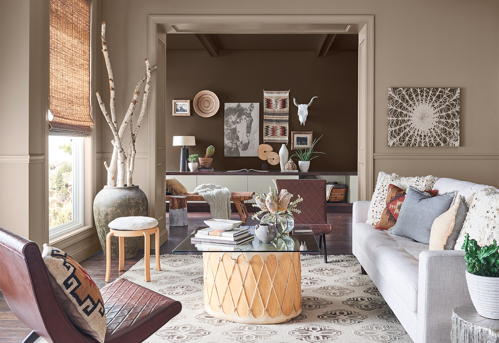
Benjamin Moore's Color of the Year 2020
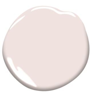
Benjamin Moore just revealed it’s Color of the Year for 2020: First Light 2102-70. Not only does First Light bring an air of calm and relaxation, the complimenting color combinations are endless, making it such a versatile color choice. Benjamin Moore describes First Light as a “soft, rosy hue blooming with potential.” We have to agree! Here’s what we think of the new Color of the Year!
Benjamin Moore just revealed it’s Color of the Year for 2020: First Light 2102-70. Having studied The Psychology of Color, we know how important color is to our everyday lives when it comes to our living spaces. Not only does First Light bring an air of calm and relaxation, the complimenting color combinations are endless, making it such a versatile color choice. Benjamin Moore describes First Light as a “soft, rosy hue blooming with potential.” We have to agree! Here’s what we think of the new Color of the Year!

Why We Love It!
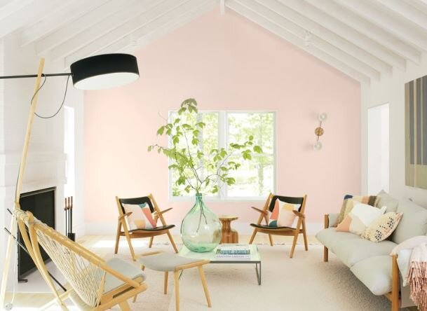
First Light is gender neutral enough to use in any room with the right compliments. The bright and airy color makes a room feel more open, especially when combined with lots of natural light. It’s uplifting, cheery, and serene; whether used for the entire space or a nice accent wall, First Light is definitely a great choice!
It pairs well with so many colors, but our favorite pairings are Blue Danube 2020-03 and Crystalline AF485.

Blue Danube

Crystalline
"First Light 2102-70 reflects a new definition of the home—a shift in mindset from the material to satisfying the core needs in life: community, comfort, security, self-expression, authenticity and ultimately, optimism.” -Andrea Magno, Benjamin Moore's Director of Color Marketing and Development

How to Use it
We would absolutely love to see First Light on a ceiling! It’s soft enough to not feel overwhelming but brings enough hue to create a nice accent. It is a great alternative for someone who tends to stay away from bold colors but still wants an alternative to white and beige shades.
This color also lends itself to the use of sage green accents, lots of natural plant life and succulents, and mixed materials. Mixing elements such as concrete or natural wood creates a great contrast with this color.
This versatile color would work well in a sunny kitchen, a comfortable living room, or a relaxing bedroom. So many options!

Need help finding the perfect paint palette for your space? Schedule a design consultation today!

Cabinetry Basics: Frames and Door Styles
When you decide it’s time for new kitchen cabinets, the decision can be both liberating and overwhelming. Your cabinetry defines the style of your kitchen and home. You use them daily, so it’s important to select quality cabinets that are aesthetically pleasing while still catering to your needs. Here are a few basic points to consider when you’re updating your kitchen cabinets.
When you decide it’s time for new kitchen cabinets, the decision can be both liberating and overwhelming. Your cabinetry defines the style of your kitchen and home. You use them daily, so it’s important to select quality cabinets that are aesthetically pleasing while still catering to your needs. The exterior of your cabinets is just as important as how you use them to store you kitchen appliances and dishes. Here are a few basic points to consider when you’re updating your kitchen cabinets.
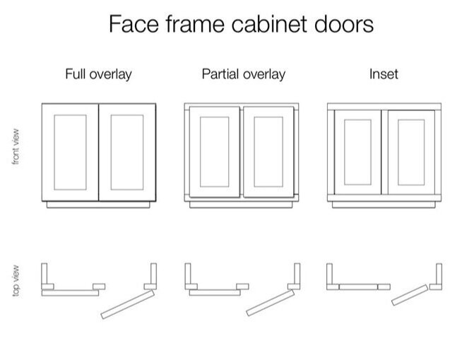
Framing Choices
Full Overlay
Full overlay cabinets provide a more custom look. These cabinets can be framed or frame-less. Double door frame-less cabinets with full overlay doors do not have a vertical face frame stile between the two doors, which allows you to store larger items. You also gain an extra inch of space!
Partial Overlay
The most recognizable characteristic of a partial-overlay cabinet is the consistent 2” strip of the frame visible between the doors and drawers. The doors sit on top of the frame and have a small gap. Keep in mind your doors and drawer faces will be smaller this option. These are often the least expensive option.
Inset
Usually the most expensive option, inset doors and drawers are set into the cabinet frame and fit flush with the face of the cabinet when closed. Hardware is needed with inset cabinetry, since there is no space between doors and doors to pull. With this type of door, the hinges can either be concealed or exposed for an accent detail.

Red Oak

Cherry
Materials
There are so many combinations of wood finishes and styles that the possibilities are nearly endless. Cherry, Maple, Ash, Hickory, Mahogany, Birch, and Oak are popular wood choices and they all come in many different finishes.
These wood finishes are just a handful of wood and finishes available for custom cabinets from Top Cabinetry.

Mahogany

Walnut
Door Styles
Whether you prefer a traditional or modern style for your kitchen, the door style of your cabinets will speak the most about your taste. These are just a few examples of the styles available.
Slab or Shaker
Shaker and slab style doors create a clean and uncomplicated look that really show off the wood and finish. These are easy to maintain and perfect for a modern or contemporary kitchen.


Slab

Raised Panel

Reverse Raised Panel

Reverse Raised Ornate Panel
Raised or Reversed Raised Panels
For a more traditional design, paneled cabinet doors are a good choice. They create a warm and cozy atmosphere and can be more ornate in style.
Glass and Mullion
Glass cabinets are the perfect way to show off your beautiful glassware, china, or dishes. While they are most popular for upper cabinets, mullioned glass cabinets can be a beautiful accent to a lower cabinet on a kitchen island. Solid glass or ornate mullioned designs, these cabinet doors bring an air of sophistication and create an open, airy feeling to your kitchen.


Beveled Glass Door
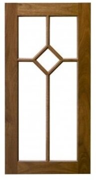
Mullioned Glass Door
Need help finding the perfect cabinets for your kitchen? Schedule a design consultation today!

Throw Pillows: It's All in the Details
It’s all in the details when it comes to creating a space that is uniquely yours. The easiest way to create a layered, detail-filled design is with your decorative throw pillows. Pillows can be simple, have a little detail, or be over-the-top ornate. Here’s everything you need to know about throw pillow details.
“The details are not the details. They make the design.” - Charles Eames
It’s all in the details when it comes to creating a space that is uniquely yours. The easiest way to create a layered, detail-filled design is with your decorative throw pillows. Pillows can be simple, have a little detail, or be over-the-top ornate. Here’s everything you need to know about throw pillow details.
The Basics
Knife Edge
Knife edge pillows are the simplest forms. There are no ornate details around the edges, just the fabric sewn together, creating a sharp corner.These pillows create a clean, contemporary look that works with any decor.


contrast welt - romo
Welting
What’s a welt? A welt is simply a thin cord covered in fabric that creates a decorative ridge around the pillow. Welting provides a tailored look and gives a outline to the pillow.
Self Welting uses the same fabric as the pillow.
Contrast Welts use a separate fabric to create a contrasting look.

jayson home - Contrast Welt
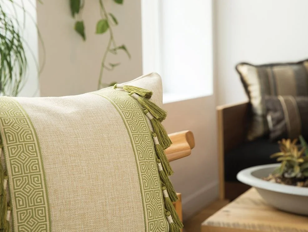
Flanges
What’s a flange? A flange is a piece of fabric that extends beyond the seam of the pillow, giving it a soft, feminine detail.
There are a number of possibilities when it comes to flanges. They can be self or contrasting, split, or even ruffled.
A split flange creates two separate pieces of fabric to extend beyond the seam of the pillow, creating more volume, and can even be done in two different fabrics!
A butterfly flange is a flange that pleats at the corner. This is also called a Turkish corner.
A ruffle flange creates a lovely ruching.


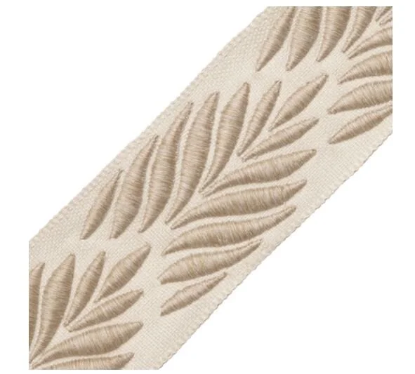
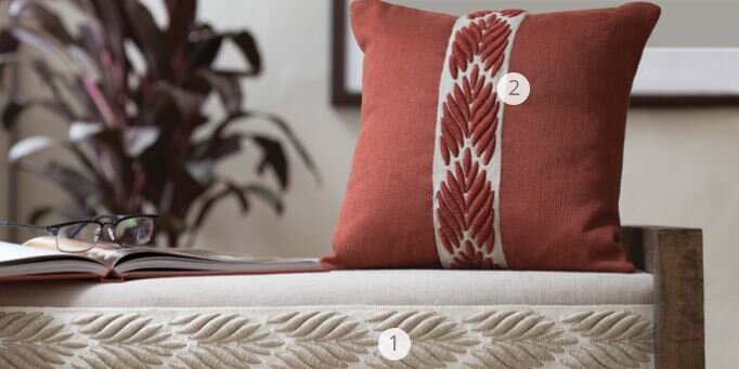
Embellishing Details
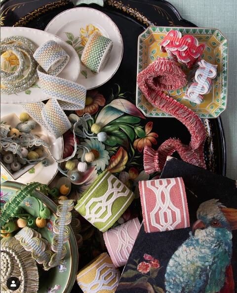
I love banding, trims, gimp, and brush fringe! These little details can take your room from basic to layered and dynamic!
One of my favorite designer resources to shop for these details is Samuel and Sons Passementerie.
Passementerie, simply put, is decorative trimmings, braids, and fringes used on home and fashion accessories.
Tape
Tape is a decorative strip of material that is sewn onto the pillow. Tape can be applied on the face, edges, bottoms, or even on the flange of a pillow. The possibilities are endless!


Fringes
What are fringes?
Fringes are trims applied to a pillow to create ornate details. They can be small, thick, long, fluffy, looped or tasseled; so many options!
Brush fringe is a technique that applies simple strands of fabric that hang off the pillow.
Tasseled fringe is trim that creates individual tassels that are applied to the pillow.
Pom pom fringe is trim with fabric balls, or pom poms, that hang off the pillow.
Our Favorite Embellishing Details Right Now


Need help finding the perfect throw pillows for your space? Schedule a design consultation today!

How to Choose Your Counter or Bar Stools
There are thousands of choices when considering counter or bar stools. Choosing the perfect one is not only about the aesthetic; it is so important to find the correct height and quantity when purchasing new stools. No one wants to eat with their food level with their face or have to lean over because they’re legs don’t fit. Here are a few guidelines when selecting your new counter or bar stools.
There are thousands of choices when considering counter or bar stools. Choosing the perfect one is not only about the aesthetic; it is so important to find the correct height and quantity when purchasing new stools. No one wants to eat with their food level with their face or have to lean over because they’re legs don’t fit. Here are a few guidelines when selecting your new counter or bar stools.
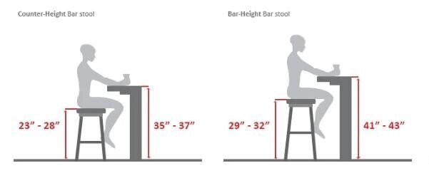
What’s the Difference Between a Counter and Bar Stool?
A standard counter stool measures between 23 and 28” from floor to seat, while a bar stool is taller, measuring between 29 and 32” from floor to seat.
HAYNEEDLE

How Do I Know if I Need Counter or Bar Stools?
In order to determine whether you need a counter or bar stool, make sure to measure from the floor to the underside of you counter or table. You need to allow 10-12” for leg room, so be sure to subtract this from your surface’s height.
Pro Tip: Always measure to the underside of the surface, not the top of the surface. Some counter tops are thicker than others or have aprons that can take away from your leg space.
For example: If your surface is 36”H to the top and 34.75” to the underside, subtract 10” from 34.75” and your counter stool should sit roughly at 24.75”.

How Many Do I Need?
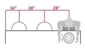
It may feel like you can eyeball an estimate for how many seats you need, but be sure to carefully measure to ensure that you are not overcrowding or leaving your space too bare. As a general rule, there should be around 26”-28” between the centers of each seat. If your table or counter is up against a wall or outside edge, be sure to include at least 14” between the last seat. No one wants to bump their elbow into the wall each time they pick up their fork!
HAYNEEDLE

What Style Should I choose?
This depends on a few things, including your personal tastes and the size of your space. If you’re working with a smaller eat-in kitchen with a breakfast bar, you may want to choose a narrower and backless stool to avoid weighing down the space. Stools with larger seats and backs can be cozier and can fill a larger space nicely, but if too big, they can make the room feel crowded. In this instance, consider choosing something of smaller proportion that is airy and visually light weight with slim legs. If you plan to sit in your counter or bar stools for long periods of time, consider an upholstered stool that will add more cushion and comfort.
Pro tip: Think about clean ability when selecting materials for your stools. Acrylic is a great option as it is easy wipe able. Leather or faux leather can also make for easy clean up. Don’t be afraid of white fabric, as long as it’s bleach cleanable, like a Perennials or Sunbrella fabric! Love the look of the stool, but the material is not practical? Have the stools reupholstered with your favorite bleach cleanable fabric or easy clean leather!

My Top 3 Favorite Stools Right Now


Need help finding the perfect stool for your space? Schedule a design consultation today!

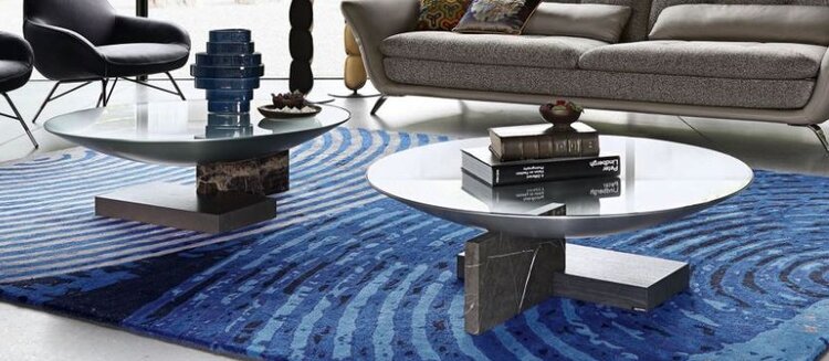
Designer Tips for Styling Your Coffee Table
Want to get creative with your coffee table decor? Play around with these different ideas and styles to make your coffee table pop! Last week, we talked about some of my favorite coffee tables right now. This week, we explore a few rules of thumb for styling your coffee table to perfection!
Want to get creative with your coffee table decor? Play around with these different ideas and styles to make your coffee table pop! Last week, we talked about some of my favorite coffee tables right now. This week, we explore a few rules of thumb for styling your coffee table to perfection!
It’s All About Proportion
Choose items to style with that are proportional to the size of the coffee table and to each other. Make sure you’re are varying the sizes of the pieces you choose. Too many “heavy” items will cause an imbalance and visually weigh down the table too much. Likewise an assortment of too many small accessories can feel busy and make the table feel cluttered. Instead, balance visually with an arrangement of a heavier element like a vase of flowers, with a stack of thin books, and some small accent pieces for conversation. Play around with materials! Acrylic is a great option, because it can occupy space on the table, but because it’s translucent it won’t add additional visual weight to your presentation.

Follow The Rule of Three
The rule of three simply states that things arranged in odd numbers are visually more appealing and memorable to the human eye than even numbered groupings. This rule does not only apply to three, but works nicely as five and seven as well. An even grouping of four or six can look staged, while an odd numbered group looks effortless and intentional.
Choose three items (or groups of items) to create the perfect balance. Good examples are stacks of books, a decorative bowl or small sculpture, and a vase of fresh flowers. When choosing books, the title and content is not all that’s important. Consider the color, size, font, spine, and overall aesthetic of the cover as well. The books become part of your homes decor.
Your choice of flowers can be a fun way to bring in a subtle touch of seasonal decorating. Play with color, texture, height and volume. Knickknacks and metallic accents, such as coasters, are a great way to introduce a variety of textures and layer your look.

I Love Decorative Trays
A tray is a fantastic way to layer smaller accessories in an eye-catching way. To mix up the geometry, try selecting a circular tray for a square table, or vise versa. A painted tray is an opportunity for an accent color, like this Spectrum Tray from Jayson Home. Consider a different element, such as metallic, bamboo, or glass to vary the textures and materials. The possibilities are endless!

Get The Right Height
Select a high, medium, and low pieces. A stack of books is a great way to add height or to boost up smaller items. If you have tall and narrow pieces to showcase, you won’t want to add the height of fresh flowers into the mix. Try a succulent or low potted cactus to add more texture and color. Have fun with your selections!

Things To Avoid
Don’t place items on the corner and leave the middle empty.
Don’t go too bare. Fill the table, but don’t overwhelm it.
Avoid lining up your objects. They should fit together nicely like puzzle pieces.
Don’t use items that are so tall that your guests can not see each other across the room.
Don’t design from one view point. Make sure it looks good from all angles.
Need help finding the perfect style for your space? Schedule a design consultation today!

My Top 5 Favorite Coffee Tables Right Now
Ah, the coffee table. A jack-of-all-trades. It holds our knickknacks, our takeout dinners, occasionally our feet, and - of course - our coffee. It is a vital piece of furniture that can change the whole atmosphere of the room. Here are the top 5 coffee tables that I’m crushing on right now!
Ah, the coffee table. A jack-of-all-trades. It holds our knickknacks, our takeout dinners, occasionally our feet, and - of course - our coffee. It is a vital piece of furniture that can change the whole atmosphere of the room and ground the space. Here are the top 5 coffee tables that I’m crushing on right now!
Raj 1 Coffee Tables from Casa Spazio
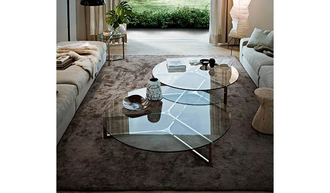
I am all about the metal Y bass and the translucent glass tops. Casa Spazio offers several different heights to create nesting tables, which are perfect to fill in a large living room. They are also a great option since they don't add visual weight. This pair are perfect!
Teak Root Table from Jayson Home
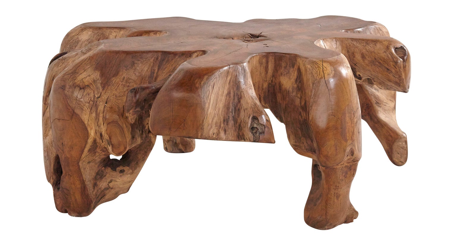
I love the organic and raw composition of this table! It’s made of sustainable teak wood harvested in Indonesia. The top of the table is sanded and polished, while the sides are unfinished, producing a unique, statement making coffee table.
Drum Storage Coffee Table from West Elm

Love the hidden storage! The antique brass and bronze finish is just gorgeous. Mixing metals is hot! The 32” diameter is a great size for most living rooms.
Allure Attraction Cocktail Table from Theodore Alexander

Stunning! Marble and channeled upholstered sides makes a dramatic contrast of hard and soft elements. With an almost 48" diameter, this table is just asking to be styled with brass metallic accents and a nice pile of books!
Vestale Cocktail Table from Roche Bobois
Love the forms and shapes of this elegant table! It has the perfect mixture of elements, from the ash bases to the finished aluminum cup.
Need help finding the perfect coffee table for your space? Schedule a design consultation today!

ASID Illinois' Rising Star, 2019: Sarah Schwuchow
Congratulations to our Owner and Principal Interior Designer, Sarah Schwuchow, who was named as the American Society of Interior Designers Illinois Chapter’s Rising Star for 2019!

Congratulations to our Owner and Principal Interior Designer, Sarah Schwuchow, who was named as the American Society of Interior Designers Illinois Chapter’s Rising Star for 2019!
The ASID Rising Star Award recognizes an emerging professional who has shown dedication to ASID, the interior design industry, and volunteer efforts & contributions to the design community.
Sarah joined ASID as a student member while attending the Illinois Institute of Art, Chicago in 2011 and was elected Student Chapter President the following year. Under her energetic leadership, the Student Chapter earned two nationally recognized awards: ASID Student Chapter of the Year, 2012 and ASID Community Service and Fundraising Project of the Year, 2012.
Sarah passed the NCIDQ exam in 2018 and is a Registered Interior Designer in Illinois. Later that year, she founded a committee through ASID Illinois to provide educational programming and study skills to design professionals taking the interior design certification exam (NCIDQ). She has enjoyed serving as a mentor to many design students and other emerging professionals. She also became a CIDQ Ambassador in January of this year.
Sarah will begin serving as the ASID Illinois Director of Communications this October, overseeing all communication functions of the Illinois Chapter. She is dedicated to the mission and values of ASID and firmly believes that design impacts lives and is passionate about educating the general public on the profession of Interior Design.


Your Guide to Choosing the Perfect Rug Size
Area rugs are a great way to tie a room together. They create a warm and welcoming environment. However, choosing a rug that is too big or too small for your space can interrupt the whole vibe of the room. The right sized area rug is essential to the cohesive feel of your space. Here are some guidelines when choosing the right size for your rugs.
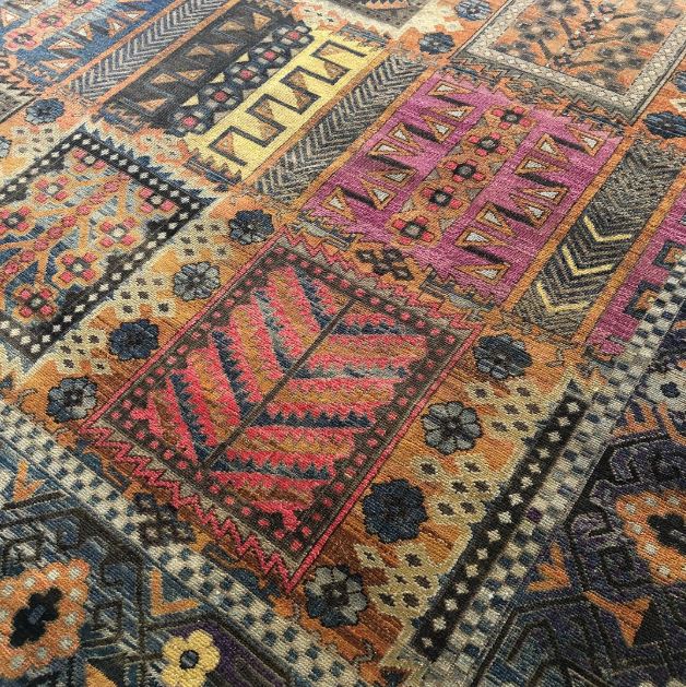
Area rugs are a great way to tie a room together. They create a warm and welcoming environment. However, choosing a rug that is too big or too small for your space can interrupt the whole vibe of the room. The right sized area rug is essential to the cohesive feel of your space.
Most standard size rugs are:
3’ x 5’ 8’ x 10’
4’ x 6’ 9’ x 12’
5’ x 8’ 10’ x 14’
6’ x 9’ 12’ x 15’
Consult with your Interior Designer if you think your space needs a customized size and shape. Here are a few tips when choosing the right size for your next rug.
Living Rooms
The first rule of thumb is cover the floor space that you have. Big room? Big rug! Long room? Long rug! You’ll also want to take into consideration where your furniture will be placed. For larger rooms with a lot of furniture, it’s best to be able to comfortably fit all your furniture on the rug. The standard sizes for larger area rugs is 9’ x 12’ or 10’ x 14’. For smaller living rooms that require the furniture to be against a wall, it’s best to choose a size around 6’ x 9’ or 8’ x 10’. You’ll want to place the front two legs of your furniture pieces on the rug.

Dining Room
For those who choose to use an area rug in their dining room, you need it to be big enough to fit the table and chairs. For safety reasons, the rug should extend at least 24” past all edges of the table to avoid chairs getting caught on the edge of the rug.
Standard sizes for dining room rugs are 8’ x 10’ or 9’ x 12’, but you can always measure your dining room table and add 2 feet to all sides for a good starting place.

Bedrooms
There are a few options for rug choices and sizes when it comes to your bedroom. If you’d like a larger rug under the bed, you’ll want to make sure that it extends on either side of the bed. The rug should also extend past the foot of the bed. A standard size rug for a queen bed is 8’ x 10’ and a king bed requires at least 9’ x 12’.
If you’re looking for a more minimalist option, two runners on either side of the bed (or even just the foot!) can bring a higher level of comfort to your bedroom, even in an already carpeted space. You’ll want to shop for rugs sizes of 2’ 6” x 8’ or 3’ x 5’.
Kitchens
Whether it’s a smaller rug in front of the sink or a runner between an island and your cabinets, a rug can bring texture and color to your kitchen, complimenting your wall and cabinet colors. For a kitchen with limited space, like a galley kitchen, a runner that runs the length of the space is an excellent way to add a little warmth and comfort underfoot. Bonus: vintage runners in the kitchen are an awesome design trend right now!
Some standard sizes for a kitchen runner are 2’ 6” x 8’ or 3 ‘ 5’.
For open concept or country kitchens, a smaller rug in front of sink where there is generally a lot of foot traffic is a practical way of showcasing a rug. The most standard size is 2’ x 3’. Want to mix it up? Look for a half-round rug instead of the usual rectangle.
Now that you’ve found your perfect rug, don’t forget to get a rug pad!
Check out our recent post: 5 Reasons You Need a Rug Pad.
Need help finding the perfect area rug for your space?Schedule a design consultation today!

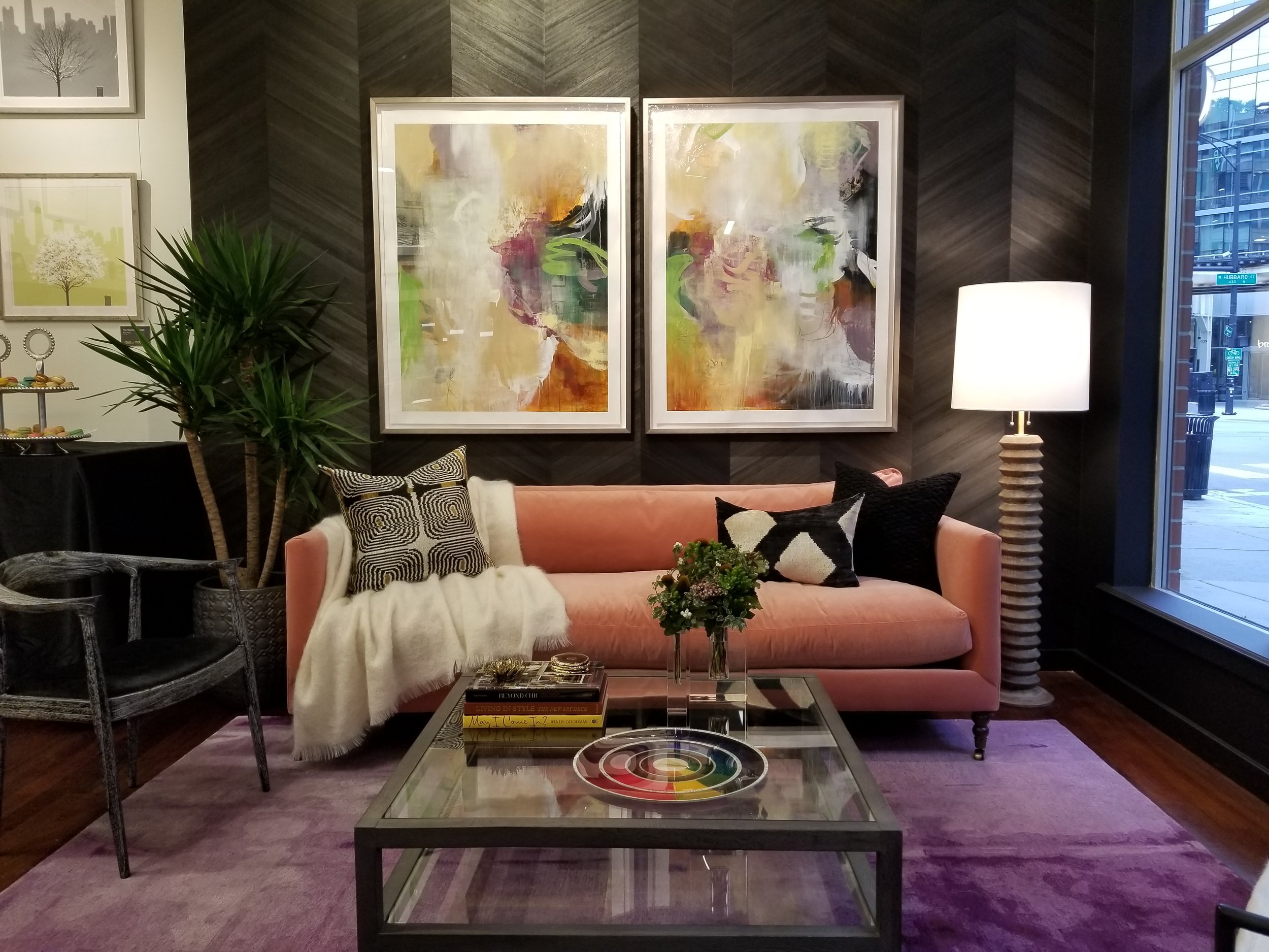
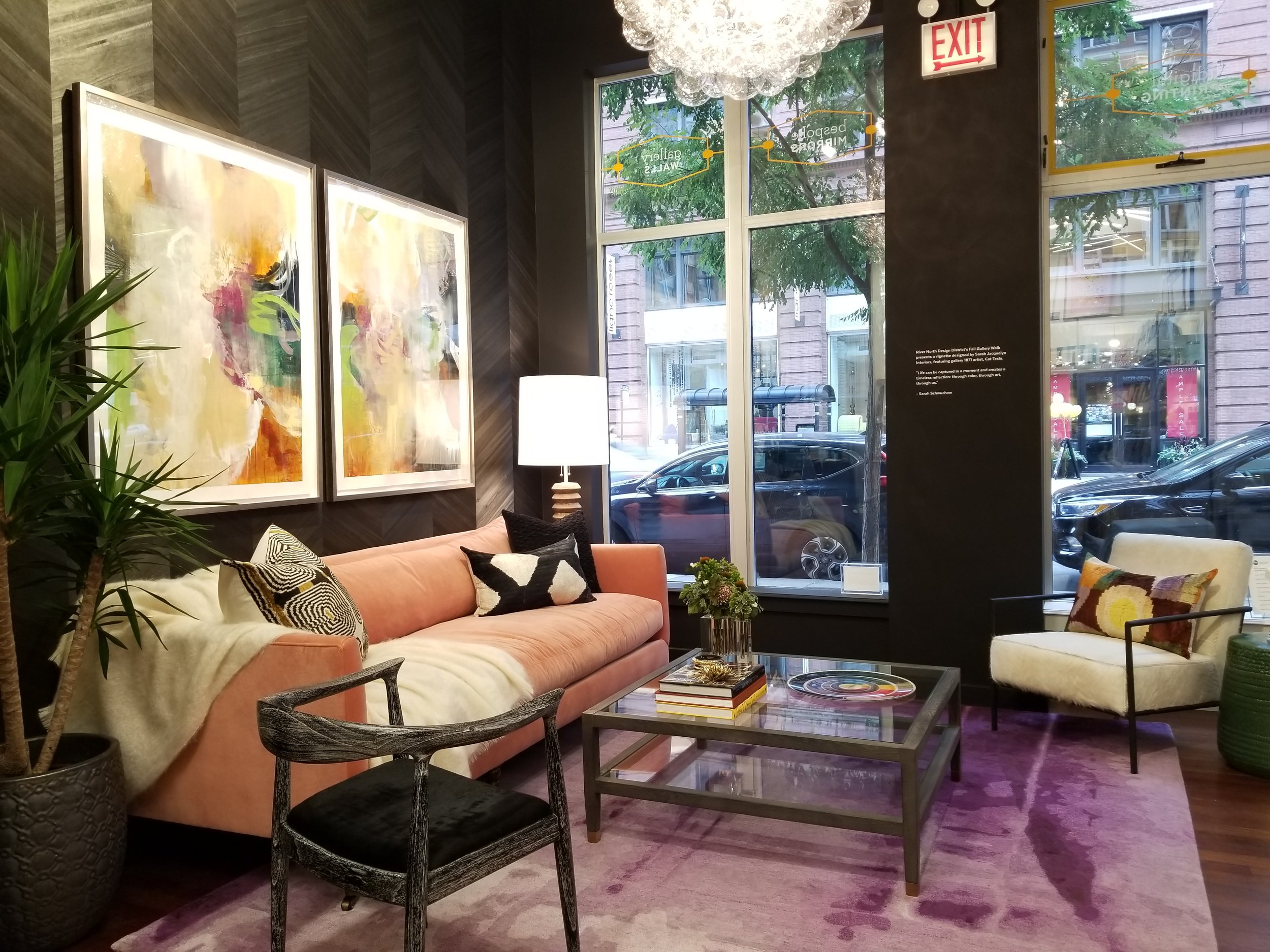
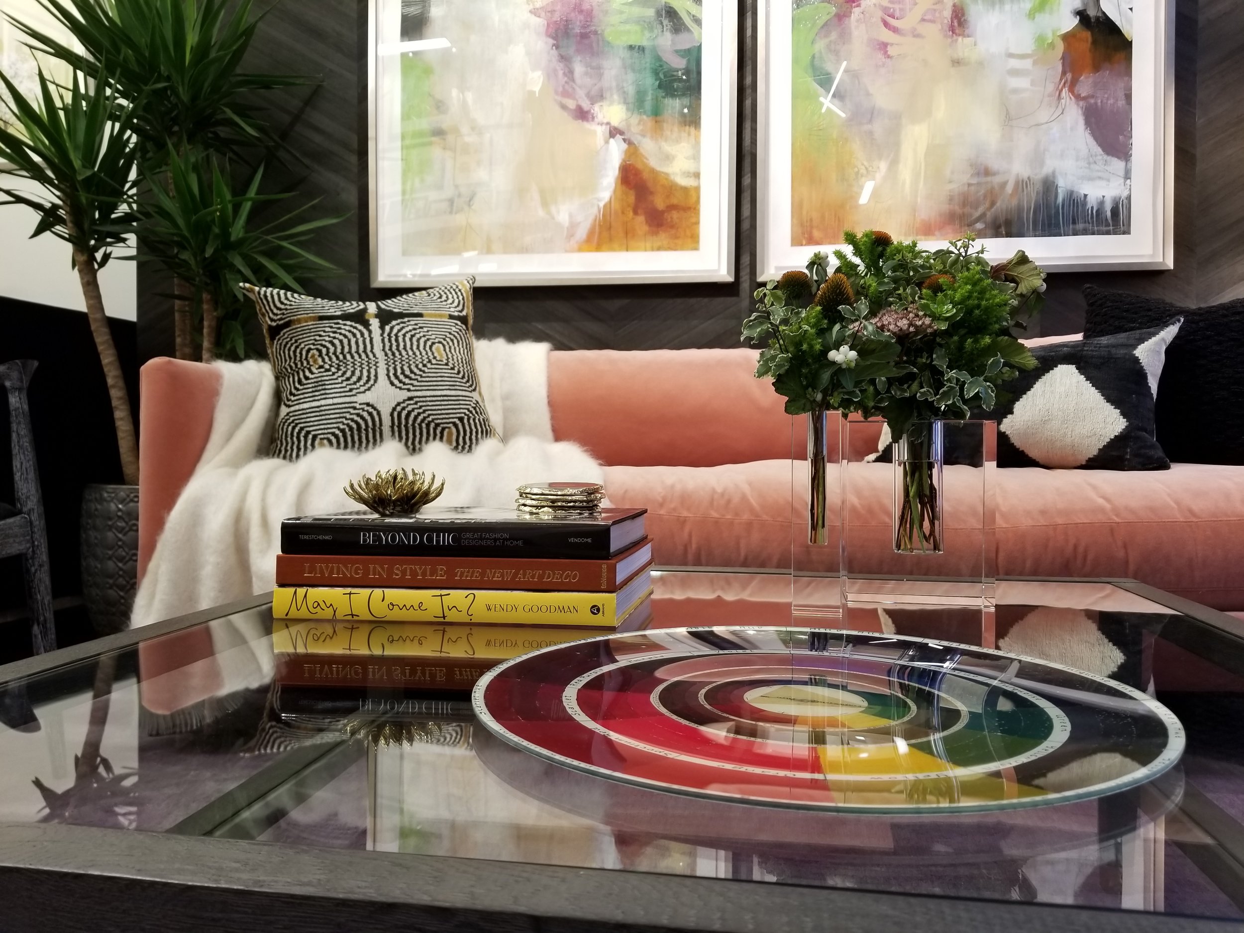
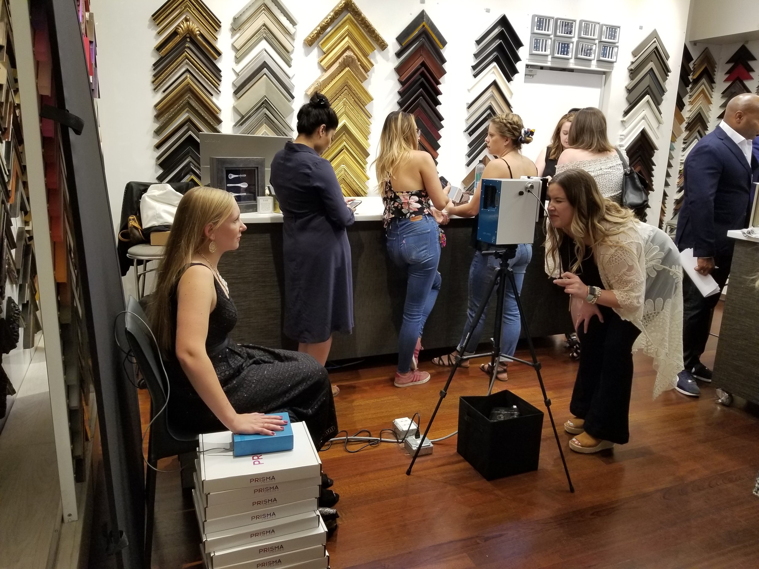
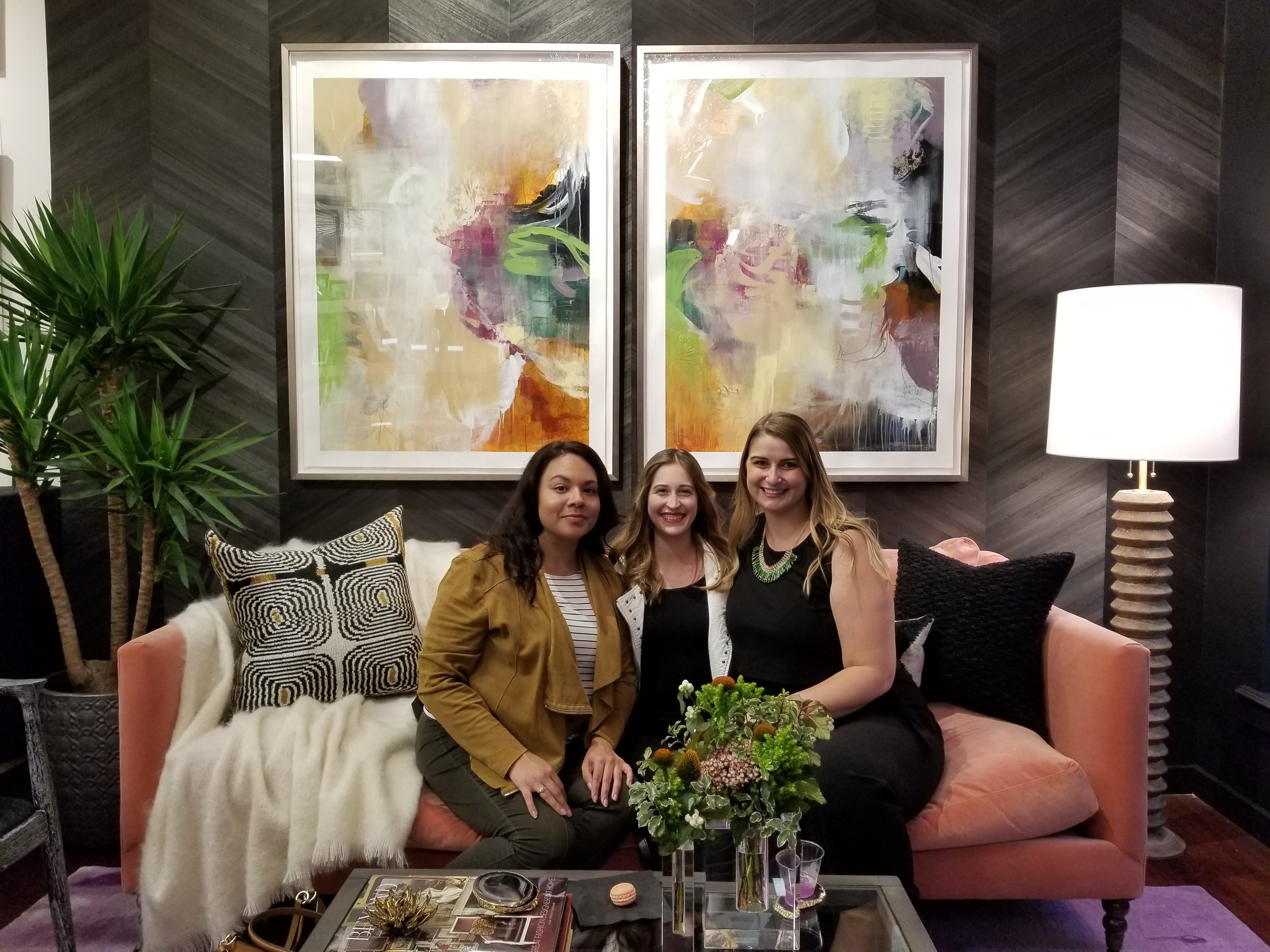
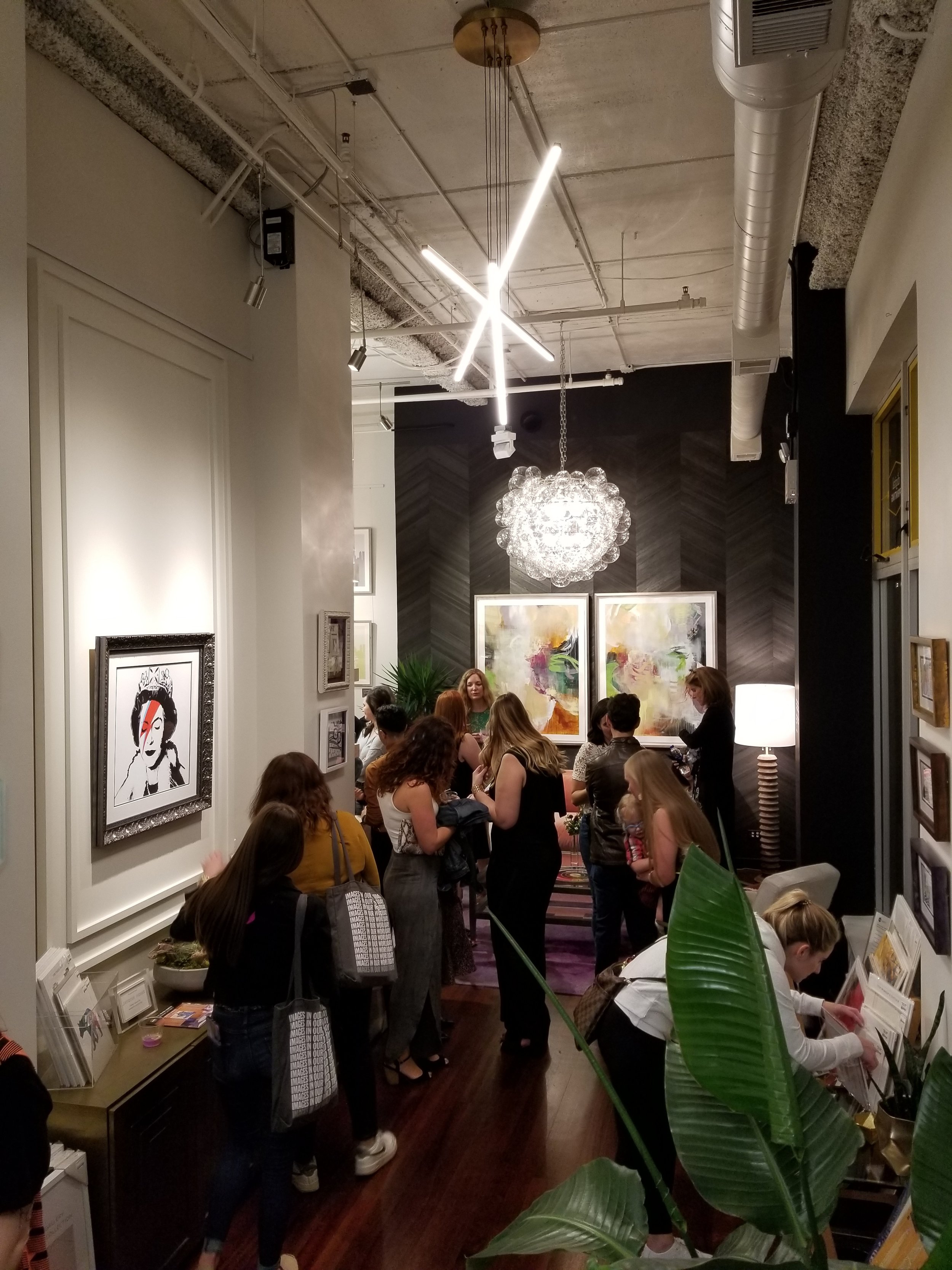
A Night of Color at Artists Frame Service: Our RNDD Gallery Walk Vignette
We had such an exciting night this past Friday at the River North Design District’s 5th Annual Fall Gallery Walk! Our vignette was featured at Artists Frame Service and showcased the ethereal art of gallery 1871’s Cat Tesla. We captured our true colors with aura photographer Revealing Soul, were captivated by color-changing cocktails, and enjoyed fabulous company and great conversation.
We had such an exciting night this past Friday at the River North Design District’s 5th Annual Fall Gallery Walk! Our vignette was featured at Artists Frame Service and showcased the ethereal art of gallery 1871’s Cat Tesla. We captured our true colors with aura photographer Revealing Soul, were captivated by color-changing cocktails, and enjoyed fabulous company and great conversation.
The walk featured 33 showrooms exhibiting designer vignettes from Chicago’s top designers, showcasing living settings highlighting artwork created by some of the brightest stars in the art world today.
Here are some highlights from our opening night on Friday!


Our Color Changing Cocktail - The Chroma!
These were so fun to watch and they were also super delicious!
Meet the artist, Cat Tesla of gallery 1871
“My work includes both ethereal landscapes and abstract designs. The subjects I choose to paint are organic, either originating from Mother Nature, or inspired by her. I love building layers using painting and drawing, scraping back, then adding more, pooling juicy paint, and pouring glossy translucent glazes over the surface. My artwork provides the viewer with a bold graphic element from a distance, but up close they're rewarded with rich organic details and texture.”
Cat Tesla is an international artist of 22 years. After a high-stress profession working in human genetics, Cat turned to the natural world, meditation, and yoga. She began studying art in the evenings and went on to obtain a degree in graphic design, followed by studies/residencies with Nicholas Wilton and Steve Aimone. She was “inspired to put nature to canvas - the shapes, colors, and feelings.”
Cat is a resident artist of gallery 1871 of Chicago Art Source. Her Timeless series pieces featured in our vignette are available for purchase.


Aura Photography by Revealing Soul
Aura Photography is the art of capturing an individual’s aura through photograph in a beautiful array of colors. Revealing Soul was an amazing addition to the evening, taking plenty of photographs and offering free readings!
According to my aura’s colors, I am career oriented and currently experiencing an abundance of growth; I am going through a transformation of personal balance. I’d call that a great reading!

Missed us last Friday? There’s still time to see our vignette!
The Fall Gallery Walk vignettes will be up in each showroom through October 7.
Make sure you stop by Artists Frame Service on Wells street and take a look!

We could not have had such a successful opening night without the help of many hard working individuals! We owe a huge “thank you” to all our contributors!


The Psychology of Color in Interior Design
I love using color as a communication tool in my interior design projects. In order to do that effectively, it’s important to understand how colors behave and how they can influence our mood. Color psychology suggests that some colors may increase anxiety, while others can boost your energy level. Your home should be your sanctuary, so it’s important to understand the emotional impact a color will have in your home.
I love using color as a communication tool in my interior design projects. In order to do that effectively, it’s important to understand how colors behave and how they can influence our mood. Colors evoke emotional responses in everyone. The psychology of color is used around us every day and is an important tool for transmitting information. A red stop sign prompts you to stop and look around; a brightly colored playground evokes feelings of joy and youthfulness.
The colors you choose for your walls and furniture have a big impact on your mood and emotions too. Color psychology suggests that some colors may increase anxiety, while others can boost your energy level. Your home should be your sanctuary, so it’s important to understand the emotional impact a color will have in your home.
Here are some things to take into consideration when choosing a color palette.

“Color is a power which directly influences the soul.”
-Wassily Kandinksy
Red
Red is the color of passion and drama. It attracts the most attention and is often associated with strong emotions such as love and anger. Red is used universally to communicate danger or power. While it is vibrant and exciting, it also inspires feelings of lust with a strong link to sexuality.
Color psychologists have proven that red can increase blood pressure and stimulates the adrenal glands. In color therapy, red is often used to help dispel negative thoughts and release anger.
Red | Emotions
Excitement
Energy
Passion
Attention
Orange
Orange is the color of optimism and is socially inviting. This color is for the extrovert, exuding energy and motivation. The combination of yellow and red makes orange, conveying warmth and excitement and typically appeals to younger people. Orange is often used as a natural antidepressant in color therapy and can relieve feelings of self-pity. It is also thought to help strengthen the immune system and aid in digestion.
Orange | Emotions
Optimism
Independence
Adventurous
Creativity
Youthfulness

Yellow
Yellow is full of energy and happiness. It conveys youthful optimism and freshness. The color of sunshine, it is uplifting and illuminating and often associated with success and confidence. Yellow stimulates the left side of the brain, which aids in clear thinking and quick decision making.
In color therapy, yellow is used to create uplifting feelings. It stimulates the brain and can make you more alert and energetic. Yellow also builds self confidence, yet some may find that it can also trigger feelings of fear and anxiety.
Yellow | Emotions
Enthusiasm
Opportunity
Spontaneity
Happiness
Positive
Green

Found in all of nature, green is the color of growth and health, expressing renewal and life. Green has a strong association as a refreshing and peaceful color. It evokes feelings of abundance while providing a restful and secure feeling.
Green is thought to be good for your heart and also helps you breathe slower and deeper. It creates feelings of comfort and relaxation as we are reminded of nature. However, olive greens have been known to convey thoughts of decay and death and may be detrimental to psychological and emotional health.
Green | Emotions
Safety
Harmony
Stability
Reliability
Balance
Blue
The hue of the sea and sky, blue communicates a tranquil emotion that induces peace and serenity. This calming color instills confidence and inspires feelings of loyalty, integrity and responsibility. A cooler blue is conservative, responsible, and can instill feelings of security.
Blues are often used to reduce stress, increase relaxation and has been proven to lower blood pressure. Blue inspires mental control and clarity. Though it is calming, too much blue can increase feelings of depression.
Blue | Emotions
Trustworthy
Responsibility
Honesty
Calming
Inner security

Violet
Violet is often associated with spirituality and royalty. The energy of red combined with the calm of blue, it is a color that inspires intrinsic qualities and reflection. It is the color of the introvert. It is often used to encourage creativity and communicate luxury.
Violet has an antiseptic effect. In color therapy, it is used to treat mental and nervous disorders, as it can help to balance the mind and transform obsessions and fears. It also has a cleansing effect in regards to emotional disturbances.
Violet | Emotions
Imagination
Mystery
Sensitivity
Compassion

Need help creating a color palette for your home? Schedule a design consultation today!

Renew Your Illinois Interior Design License - Expires August 31st!
Registered Interior Designers in Illinois (RID): You must renew your active license before it expires on August 31, 2019. Once renewed, licenses are good for two years and always expire on odd years. Read the step by step instructions here on how to renew your Interior Design License today.

Registered Interior Designers in Illinois (RID): You must renew your active license before it expires on August 31, 2019. The Illinois Department of Financial and Professional Regulation (IDFPR) is moving away from sending paper based renewal notifications and will only be sending electronic notifications.
Make sure your renewal notice email does not get lost in your inbox! Search for an email from FPR.Notice@illinois.gov with the subject line as “Interior Designer Renewal Notice”. This email contains your license number and pin number that you will need to renew your license.
To check if your license is active, click the link below, select INTERIOR DESIGN and enter your name.
https://ilesonline.idfpr.illinois.gov/DFPR/Lookup/LicenseLookup.aspx
All Interior Design licenses will expire on August 31, 2019 if not renewed! Once renewed, licenses are good for two years and always expire on odd years.
If you have any questions or concerns about the renewal process, contact the Department at 1 (800) 560-6420 or send a message here.
8 Steps to Renew Your License Today

1. Visit the IDFPR website http://www.idfpr.com/Renewals/defaultSSL.asp
2. Select the BLUE box “Professions Currently in Renewal”
3. Click “Interior Designer”
4. Click the GREEN box “Credit Card - Internet Renewal”
5. Scroll down and click “Continue”
6. You will need to enter your License Number and Pin Number. You can find this in the email that was sent to you from FPR.Notice@illinois.gov with the subject “Interior Designer Renewal Notice”. If you can’t find your pin number, you can enter your social security number or date of birth.
7. Submit your payment. The Interior Design Renewal fee is $60.00, plus applicable processing fees, and is good for 2 years. Payments are non-refundable.
8. You will receive a confirmation email once your payment has been submitted. It generally takes 2 business days for the renewal processing. Once updated, print and save a copy of your renewed license, as the IDFPR is no longer mailing paper licenses.

6 Steps to Selecting the Perfect Ceiling Fan
Ceiling fans come in a variety of sizes, heights, styles, and colors. Choosing the right size fan for your space ensures it will provide efficient air flow. Here are 6 steps to selecting the perfect ceiling fans for your home!
Ceiling fans come in a variety of sizes, heights, styles, and colors. Choosing the right size fan for your space ensures it will provide efficient air flow. Though ceiling fans are not usually considered the focal point of a room, the right one can tie a room together while providing maximum comfort. Here are 6 steps to selecting the perfect ceiling fans for your home!
1. Select the Right Size
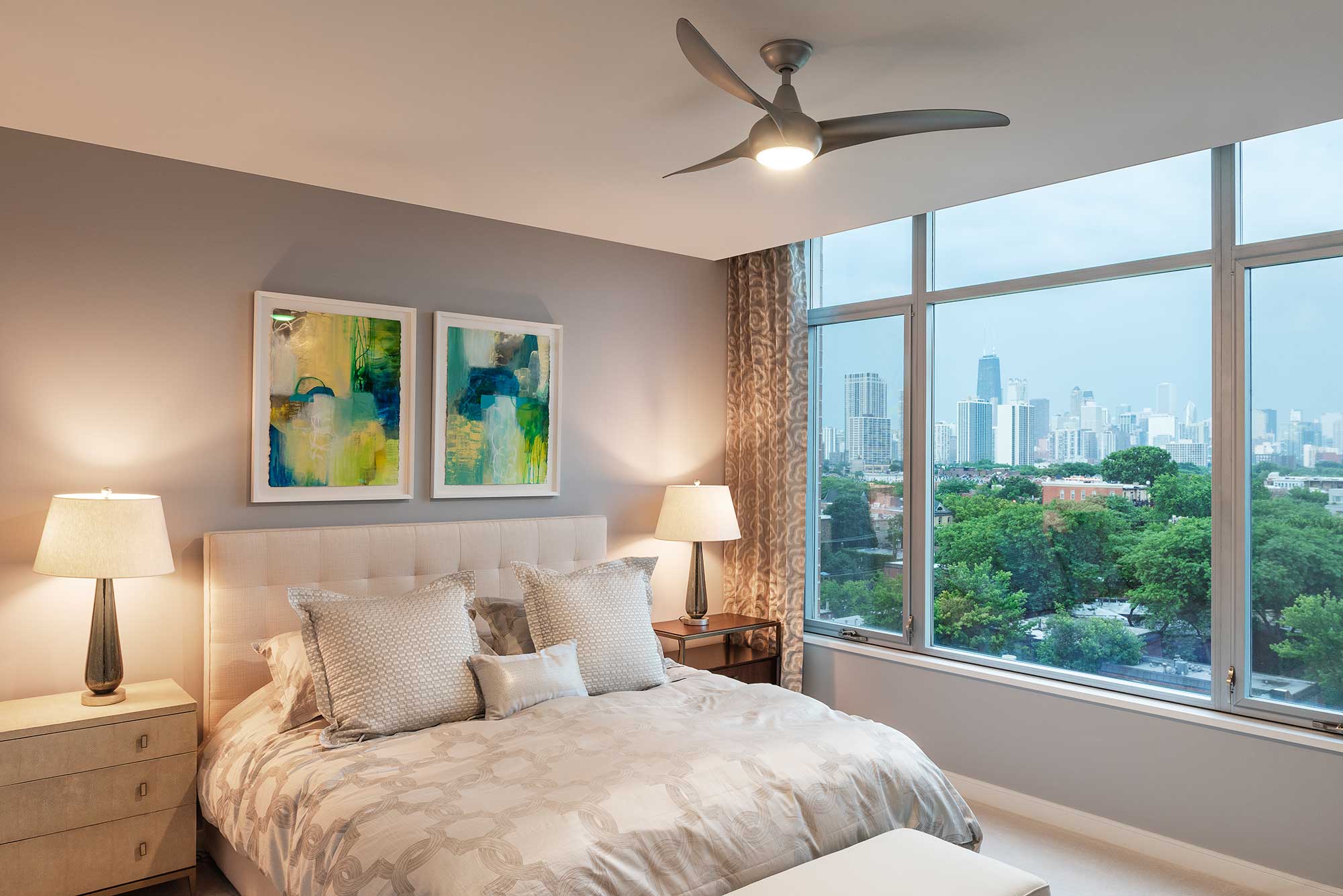
Lightology
Getting the right fan is all about proportion. Make sure to measure your room first so you know what size blade span to be looking for. The blade span of a fan is the diameter of the blades while they’re spinning, measured from the tip of one blade to the tip of the blade across from it. A fan that is too small for a space will not provide efficient air flow to the whole room. A fan that is too large will not provide any air flow directly below it.
BATHROOMS & SMALL SPACES (Less than 100sqft): 29” - 36” Blade Span
BEDROOMS & KITCHENS & DINING ROOMS (100-150sqft): 40-50” Blade Span
FAMILY ROOMS & LARGE ROOMS (350sqft): 52-60” Blade Span
EXTRA LARGE ROOMS (350sqft+): 60” Blade Span or Larger
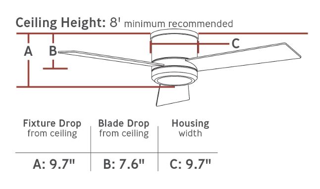
2. Height Matters
For optimum air circulation, you want your ceiling fan to be about 7-8 ft. from the floor and at least 8” down from the ceiling. For higher ceilings, you might need a downrod to suspend your fan farther from the ceiling. For spaces with lower ceilings a flush-mount model (or ceiling hugger) will keep your fan from being lower than 7 ft.

3. Switching Directions
Make sure your fan blades can switch directions. In the summer, your fan blades should run counter clockwise at the highest speed to push air down. In the winter, set your fan to run clockwise at a low speed so the blades gently pull cooler air up to keep your space warm and cozy.

4. Choosing a Style
Now that you know what size and mount your space requires, you’ll need to choose the right style. You could compliment the decor of your space, or have it just blend in and disappear.
A modern fan creates clean lines and compliments a minimalist decor, communicating style and a little edge. A traditional fan can be a little more ornate and works well in warm spaces to create a sophisticated atmosphere. Period specific fans have the benefit of modern technology while still showcasing a vintage look. Transitional styles provide modern lines with a little detail, and can compliment crown moldings nicely.
5. Controlling your Fan

Make sure your fan is controllable the way you want it. Some fans are wall controls, others come with remotes, and some are pull cord chains.
There are positive and negative aspects to all of these control options. Wall controls are the most reliable, don’t require a battery powered remote, and can’t get lost. However, they require more labor to install and cannot be easily relocated.
Remote controls can be controlled from anywhere within the room. They are cheaper and easier to install, but they do require batteries and run the risk of being lost or damaged. Replacement remotes will also need to be installed by a qualified electrician.
Pull cords are reliable, can’t get lost like a remote, but it is sometimes hard to tell what speed the fan is on. They can often hang too low in lower ceiling or may be hard to reach with a higher ceiling.

6. Installation
Make sure you consult with an electrician to ensure proper and secure installation of your new fan. If you only have a ceiling light fixture in the room, additional wiring may need to be run to accommodate the electrical needs of the fan. A good electrician will be able to guide you with these requirements.
Need help finding the perfect ceiling fan for your space?Schedule a design consultation today!

Understanding the NCIDQ and How it Benefits You as an Interior Designer
We are on a mission to help other designers pass the NCIDQ exam and become Registered Interior Designers! Just starting to think about taking the NCIDQ exam can be daunting. We break down the requirements with step by step instructions on how to become an NCIDQ Interior Designer this fall!
It’s that time of year again! Application review for the Fall 2019 NCIDQ exam has begun! Applications must be completed and submitted by July 15th in order to be considered to sit for the October 2019 exams. As a CIDQ Ambassador, this is an incredibly personal topic for me, and I’m on a mission to help other designers pass the NCIDQ exam and become Registered Interior Designers!
It’s officially been 1 year since I earned my NCIDQ certification and became a Registered Interior Designer in Illinois. This certification has benefited me in numerous ways, from opening my own business, to having the confidence and knowledge to effectively communicate on a job site. This exam is not just for commercial interior designers; I use my NCIDQ knowledge everyday as a residential interior designer and highly recommend all interior designers work towards this certification.
Over the last year, I have helped many aspiring designers work towards that certification as well. As the ASID IL NCIDQ Committee Chair, this spring I lead a study group of 5 designers towards NCIDQ success. Everyone in our study group passed their exams, with Meahgan Pearson and
Lauren Visco passing the first part of the exam, the IDFX and three people completing all of the exam sections this spring. Congratulations Kelly Somrek, Erin LeGate, and Candice Spotted Elk on becoming NCIDQ certificate holders!
Just starting to think about taking this exam can be daunting in itself! I’m here to help break down the requirements and get you on track for taking the exam this fall 2019! Keep reading below for step by step instructions on how you can become NCIDQ Certified.
Please note - the statements on this website are my own and not a reflection of CIDQ as an organization. This blog post is intended to be a supplementary guide for your NCIDQ journey. Please visit CIDQ.org for more information regarding qualifications, expectations, current prices, etc. Familiarize yourself with the CIDQ website, eligibility requirements, application process, registration process, and important dates and deadlines!

What is NCIDQ Certification and Who is CIDQ?
The NCIDQ exam stands for the National Council for Interior Design Qualification. This is a globally recognized exam and the highest standard an Interior Designer can earn. The NCIDQ Exam was created by the Council for Interior Design Qualification (CIDQ). Once you pass all three sections (IDFX, IDPX, Practicum) of the the NCIDQ Exam, you become an NCIDQ Certificate Holder. You can then use the NCIDQ appellation after your name: Sarah Schwuchow, NCIDQ. The exam is offered for the entire months of April and October at Prometric Testing Centers. All three sections of the exam are now computerized.

CIDQ History
CIDQ was created by the American Institute of Interior Designers (AID) and the National Society of Interior Designers (NSID) in the late 1960s. The group officially incorporated as a not-for-profit in 1974 and was the basis for issuing credentials to Interior Design professionals. The AID and NSID would eventually merge to become what is now the American Society of Interior Designers. CIDQ went on to run as an independent organization, which administers the NCIDQ exam
10 Reasons Why You Should Take the NCIDQ Exam
NCIDQ Certification sets you apart from unqualified designers and decorators.
It is an indicator of your proficiency and knowledge.
NCIDQ Certification shows your commitment to the Interior Design profession.
You’ll earn respect among your colleges, employers and clients.
You’ll have the potential to earn more money and promotions, as many firms require NCIDQ Certification.
Increasing the number of registered/licensed designers elevates our profession.
NCIDQ Certification helps with legislation and Interior Design rights.
In Illinois, you must be an NCIDQ Certificate Holder to become a Registered Interior Designer.
Registered Interior Designers in Illinois now have the right to file liens. Unregistered designers and decorators do not hold this right.
“To date, more than 30,000 people around the world have earned NCIDQ Certification, the goal standard for interior design professionals” (CIDQ.org).
What’s on the NCIDQ Exam?
“The strenuous requirements of the NCIDQ Examination give clients and employers added confidence in the caliber of work from NCIDQ Certified designers” (CIDQ.org).
The NCIDQ examination is no walk in the park. The level of difficulty proves that a NCIDQ designer possesses the knowledge and expertise for building systems, codes, construction standards, contract administration, design application, professional practice, and project coordination.
The exam is broken down into 3 parts: Interior Design Fundamentals (IDFX), Interior Design Professionals Exam (IDPX), and Practicum 2.0. Each section measures a candidate’s knowledge and proficiency on different topics related to health, safety, and welfare. All exams are taken during the entire month of April and October. Applicants have five years to complete all three exams. For the fall 2019 exam, you must have your application submitted by July 15th for review.
Fundamentals Exam (IDFX)
Eligibility: Candidates can take this part of the exam before completing their work experience hours. This exam can be taken as early as a student’s final year of school for a Bachelors or Masters program.
Exam Format: 125 multiple choice questions (100 scored and 25 unscored pilot questions)
Exam Length: 3 Hours
Application Fee for IDFX Only: $95.00
Registration Fee: $295.00
Passing Score: 500 (Scores are weighted and on a scale of 200-800)

Professional Exam (IDPX)
Eligibility: Candidates must complete their education and work hours before applying for this exam.
Exam Format: 175 multiple choice questions (150 scored and 25 unscored pilot questions)
Exam Length: 4 Hours
Application Fee for IDPX and Prac Only: $145.00
Application Fee for all 3 Sections: $225.00
IDPX Registration Fee: $350.00
Passing Score: 500 (Scores are weighted and on a scale of 200-800)

Practicum 2.0 (PRAC)
Eligibility: Candidates must complete their education and work hours before applying for this exam.
Exam Format: Interactive computerized exam consisting of 3 case studies: large commercial, small commercial, and multi-family residential
Exam Length: 4 Hours
Application Fee for IDPX and Prac Only: $145.00
Application Fee for all 3 Sections: $225.00
Practicum Registration Fee: $455.00
Passing Score: 500 (Scores are weighted and on a scale of 200-800)

Ready to Start Testing?
Step 1: Eligibility Requirements
First things first—are you qualified to take the NCIDQ Exam? Visit the CIDQ website below for eligibility requirements based your education and work experience.
Step 2: Create an Account
Before you can apply, you must create an account with CIDQ. Click below to register and then log in with instructions received in your email. If you have trouble, email inquiries@cidq.org for help.
Step 3: Applying for the Exam
There are two route options for applying for the NCIDQ Exam:
Option 1: Apply only for the IDFX. If you apply just for the IDFX now, you will need to submit another application for the IDPX and Practicum once you finish your work experience hours.
Application Fee for IDFX only: $95.00 (Second application for IDPX and Prac will be $145.00)
Option 2: Apply for all three sections.
Application Fee for all 3 Sections: $225.00
Applications are a one time fee. Your application will also require you to submit an official transcript from your institution and your work experience (for IDPX & Practicum 2.0). Make sure you leave enough time for your sealed official transcripts to arrive, as any incomplete applications will not be considered after the deadline and you’ll have to wait until the next testing season.
Step 4: Registering for the Exam
Once your application has been approved, you will receive an email notifying you that you that can register for the exam and schedule a date at a Prometric Testing Center. Make sure to register early so you can lock in your preferred exam date!
From this point, you have 10 testing windows to pass all three sections of the NCIDQ exam. If you are only taking the IDFX, you must pass that exam within 4 exam windows. The second stage (IDPX and Practicum) must then be completed within 10 testing windows. Any scores older than 5 years are automatically voided. Registration fees occur each time you take an exam.
Registration Fees
IDFX: $295.00
IDPX: $350.00
PRAC: $455.00
Step 5: Studying
Make sure you leave yourself adequate time to study for this exam. I recommend at least 10 weeks and join a study group. Qpractice is a great online resource to help you stay on schedule. For the fall 2019 Exam, The Qpractice Study Season begins July 1st. Stay tuned for my upcoming blog post on my tips and tricks for studying for the NCIDQ Exam!


Join the more than 30,000 people around the world that have earned their NCIDQ Certification!
“Being NCIDQ certified has abled me to recognize potential possibilities and issues within areas of the technical design aspect, from space planning to material selection. Our industry is so unique & creative that everyone already stands out, but being able to understand the fundamentals of health, safety, and welfare adequately propels designers to the next level. I am now a go-to resource amongst my colleagues, and I understand a lot more details when speaking with reps, architects and general contractors on projects. Knowledge is power! ”

Know Your Finishes: How to Clean Your Faucet
Maintain your faucets by regularly cleaning them to keep your space looking bright and new for years to come! But before you bust out the bleach, make sure you know what’s safe to use and what to avoid.
Picture your brand new kitchen with a gorgeous matte black faucet. But after a few uses, you can tell it’s ready for a clean up. A clean faucet sets the mood of your kitchen or bathroom and can make all the difference in the appearance of your home. Leave it unclean for too long, and gunk and grime can build up, damaging the finish and dulling your entire space. Maintain your faucets by regularly cleaning them to keep your space looking bright and new for years to come! But before you bust out the bleach, make sure you know what’s safe to use and what to avoid.

“A CLEAN FAUCET CAN MAKE ALL THE DIFFERENCE”

Know Your Finishes
Check with your manufacturer to find out the finish of your faucet and the best way to clean it. Certain chemicals and cleaning tools can scratch or dull finishes.
Many sink & shower fixtures can now be manufactured with antimicrobial technology built in to keep your faucets hygienic between cleanings. However, if improperly maintained, this coating can be damaged by harsh cleaners or abrasive brushes.
Things To Avoid
Industrial and abrasive cleaners, bleach-based cleaners, anything labeled “all-purpose bathroom cleaner”, heavy duty scrub sponges, rough cloths & brushes. These products can permanently damage the beautiful finish of your faucet and best to avoid them at all costs.

Safe Solutions
So, what is safe to use on your faucet? Simple dish soap and water is a good place to start. Use a soft, soapy cloth to gently wipe down the surface and rinse well. Dry with a separate cloth and buff until it shines.
If your faucet still looks dull or dirty, try using a mixture of white vinegar/water. Simply dip a soft cloth into the mixture and spot clean.
Hard water stains or lime and calcium buildup can be difficult or impossible to remove with a cloth, especially if left to accumulate. Try using a soft-bristled toothbrush and baking soda. Simply wet the toothbrush, dip into baking soda, and scrub gently. Rinse thoroughly and wipe dry with a soft cloth. Make sure you check with your manufacturer beforehand, but this method is safe for most finishes.
Chemical cleaners like Formula 409® Antibacterial All-Purpose Cleaner, Fantastik® All-Purpose Cleaner, Windex® Original Glass Cleaner are also great products to use on most faucets, but again, check with your manufacturer for a full list of approved cleaners.
Ask For Advice
If you are ever unsure if a cleaning product is safe, always ask the manufacturer before trying it. Your Interior Designer can also assist you in finding the right cleaning techniques for your particular faucet.

Need help finding the perfect plumbing fixtures for your kitchen or bathroom? Schedule a design consultation today!

Hanging Chairs: Make a Statement
Hanging chairs are trending in the design world once again! These retro-chic chairs will bring out your inner child and have everyone fighting for the best seat in the house.
Hanging chairs are trending in the design world once again! These retro-chic chairs will bring out your inner child and have everyone fighting for the best seat in the house. The original hanging chair, or “bubble chair”, was designed by Finnish Interior Designer, Eero Aarnio, in 1968. Constructed of acrylic and stainless steel with a leather cushion inside, the bubble chair gave the appearance of floating freely and simply, while creating “a little cocoon that shields off the outside world.” (aarniooriginals.com) Over the years, the bubble chair has evolved into variations of the original design, with an array of different materials, textures, colors and shapes.
“I had the idea of a transparent ball, where light comes from all directions. Acrylic can be heated and blown into shape like a soap bubble, and I knew that domeshaped skylights were made that way...” -Eero Aarnio

Fun and whimsical, hanging chairs give a light and airy feeling to the room, yet can be a practical solution since they don’t have legs. They carry a sense of peace and comfort while making a creative statement. Create a haven of relaxation while adding a unique twist to your home’s design. Hanging benches are the perfect place to drift into a peaceful nap or to share a quiet moment with a loved one. Recently, Architectural Digest featured Kylie Jenner’s living room, designed by Martyn Lawrence Bullard, which showcases a luxurious floating bench.


Don’t be afraid to hang your chair from the ceiling with the help of a professional. They will ensure that your chair is hung on a load bearing joist, that the proper hardware is installed to safely bear weight (600lbs is usually a good start), and that you have enough space around the chair to swing back and forth safely. If you’re limited on modifications to your home, a more versatile option for an eye-catching hanging chair is one that is suspended from a free-standing mount. These indoor/outdoor chairs make great options for the perfect place to curl up!


The intricate detailing of these hanging chairs adds an element of luxury to a space while still creating an inviting atmosphere of comfort. Cozy up in a simple hanging chair with colorful pillows and soft throw for an appealing seating option.
With endless options for style and comfort, a hanging chair may just be the thing that your space is missing. Bring creativity and fun into your home and don’t forget to invite your friends to come “hang out”!

Need help adding hanging chairs to your space? Schedule a design consultation today!
5 Reasons You Need a Rug Pad
Many people don’t know that a rug pad is a necessity for the longevity of your rug, the protection of the floors beneath, and the safety of those who use the space. Here are 5 reasons why you need a rug pad.
One of the best moments as an interior designer is finding the perfect rug that ties the whole space together! But we’re not quiet finished; after a rug has been selected, we need to make sure we’ve got a rug pad to go with it. Far too often I see rugs without pads that are sliding all over the room, damaging the floor and thinning way too quickly. Many people don’t know that a rug pad is a necessity for the longevity of your rug, the protection of the floors beneath, and the safety of those who use the space. Whether its an inexpensive rug from Ikea or a hand-knotted rug from India, here are 5 reasons why you need a rug pad:
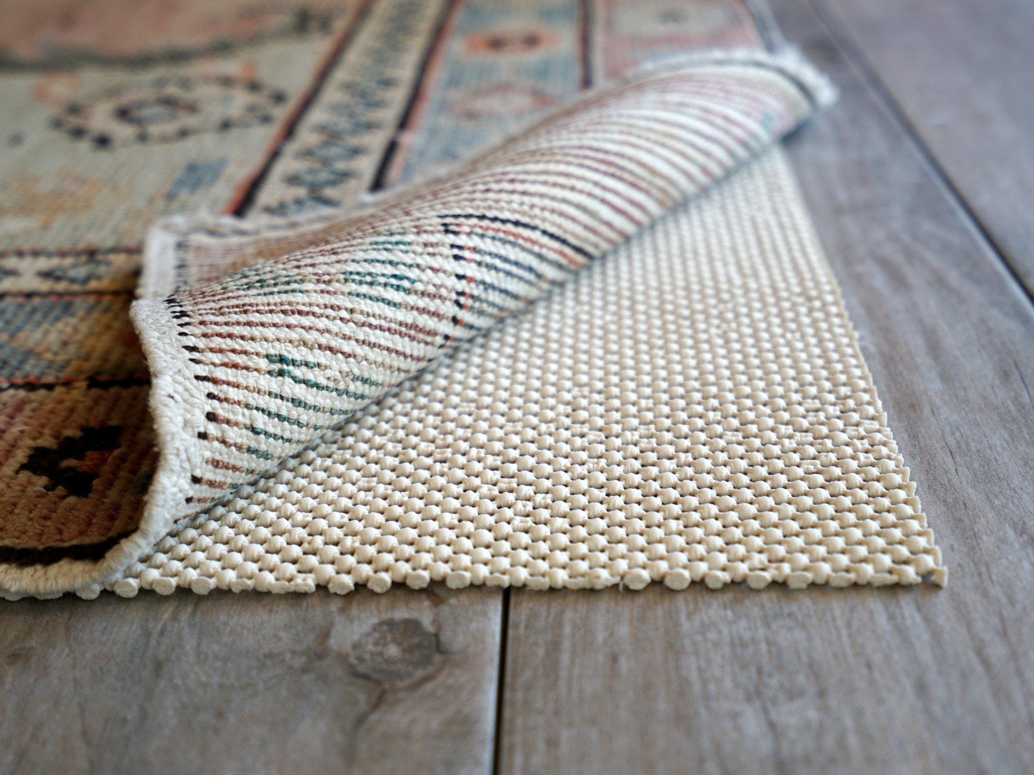

1. A RUG PAD KEEPS YOUR RUG IN PLACE
How annoying is it when you realize your rug is continually not staying in line with your furniture? A pad will also prevent thinner rugs from bunching or slipping, which could create a safety hazard.
2. A RUG PAD WILL EXTEND THE LIFE OF YOUR RUG
A little extra cushion between your beautiful rug and hard floors could add years to its life, as the pad acts a buffer between the rug and flooring. It also prevents the delicate fibers from being crushed, which creates an old and wilted looking rug.
3. A RUG PAD PROTECTS YOUR FLOORS
The backside of many rugs can be rough. If it isn’t comfortable rubbing your skin on it, then it’s a guarantee that it will end up scratching your hardwood floors. A rug pad provides protection between the floor and rug. It also saves your flooring from any crocking or bleeding. Crocking color transfer can happen when a rug is dry, just as your new blue jeans can stain other materials. Bleeding color transfer occurs when a carpet gets wet, either from a spill or flooding. This is more common with darker colors, especially blues and reds.
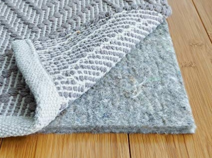
4. A RUG PAD ADDS COMFORT
Who doesn’t need a little more comfort underfoot? Especially for those with small children, sitting on the carpet playing can be uncomfortable without any additional cushioning. Not only will your rug give your space a cozy look, it will have a cozy feel.
5. A RUG PAD REDUCES NOISE
The acoustics of a room with hardwood flooring can be quite loud, with little fabric for the noise to be absorbed by. A rug can help, but a rug pad adds additional absorption of sound, reducing echo, and making your space more peaceful

Need help finding the perfect rug and rug pad for your space? Schedule a design consultation today! I love working with my clients to create beautiful and functional interiors!

What is Interior Design?
Whenever I meet someone new, I always get the question “So what does an Interior Designer actually do?” Here’s my response: “Look around this room, what do you see?
Whenever I meet someone new, I always get the question “So what does an Interior Designer actually do?”
Here’s my response: “Look around this room, what do you see? Someone had to select and layout these ceiling light fixtures, place those EXIT signs and sprinkler heads, select all the furniture and arrange it in a way that a wheel chair could pass by, specify this specific flooring material and make sure it meets slip resistance standards so you won’t fall, select that drapery fabric and make sure it meets fire code standards so that it doesn’t contribute to flame spread if the room were to catch fire.” The list goes on and on. Anytime you are in a space, it was someone’s job to specify and design every little component and make sure it meets applicable building codes, all while understanding design aesthetics on a scientific and artistic level. That’s what an Interior Designer does.

An Interior Designer can be your partner, your advocate and can help guide you through the decision making process; we help our clients realize their vision and create an environment that is uniquely theirs. It is important to involve an Interior Designer in the early stages of a project, as they can help you avoid costly mistakes, provide you with valuable resources, and help you find experts to execute the job on your timeline and budget.

The Council for Interior Design Qualification (CIDQ) recently released an updated definition of Interior Design:
“Interior design encompasses the analysis, planning, design, documentation, and management of interior non-structural/non-seismic construction and alteration projects in compliance with applicable building design and construction, fire, life-safety, and energy codes, standards, regulations, and guidelines for the purpose of obtaining a building permit, as allowed by law. Qualified by means of education, experience, and examination, interior designers have a moral and ethical responsibility to protect consumers and occupants through the design of code-compliant, accessible, and inclusive interior environments that address well-being, while considering the complex physical, mental, and emotional needs of people.”
While that may be a lot of technical jargon to sort through, the bottom line is that an Interior Designer is an all-encompassing profession when it comes to your space. I earned my NCIDQ certification in 2018 and take every effort to create aesthetic and functional solutions in my clients’ homes. I take the time to get to know my clients style, lifestyle, and emotional and physical needs. I take care of all the details that come along with an interior design project, making it as easy as possible for my clients: understanding applicable building codes, project managing contractors, sourcing high-quality vendors, and executing the project down to the last detail.

A common misconception is that an Interior Designer is the same as an interior decorator. While decorators have an eye for design and can create beautiful spaces, they lack the qualifications of education, experience, and the NCIDQ examination. Interior Designers combine artistic and technical solutions to create harmonious spaces, while also focusing on health, safety and welfare to enhance quality of life. Check out “What’s in Your Paint?” for a great example of how selecting the right paint can make all the difference in ensuring your families health and wellness.
Pinterest is fantastic way to find a style that you love, but to effectively recreate it by yourself in your own home is much more complicated than it looks. An Interior Designer can help you achieve a pin-worthy home that is sustainable, functional, and beautiful; but most importantly, it will be a reflection of you!
If you’re ready to start working on your dream home, schedule a design consultation today! No project to big or too small, I love helping my clients create a home that is uniquely theirs that they can experience to the fullest!

What's In Your Sofa?
Have you ever stopped to consider what’s inside your sofa? When it comes to furniture, it’s not all created equal. Lets breakdown the basics of what’s inside a sofa: frame, suspension, and cushions. When shopping for your next sofa, ask the manufacturer these questions.
So you’ve decide to buy a new sofa, but you don’t know where to start! You’ve see sofas advertised on sale for $399.00 at your local retailer, which sounds like a great deal! But have you stopped to think about what’s inside that sofa that makes it so inexpensive?
When it comes to furniture, it’s not all created equal. My experience as the Lead Designer and Project Manager at Covers Unlimited, a quality custom furniture manufacturer and reupholster, taught me the details and difference of what goes into making a quality piece of furniture. What may look good on the outside can be full of particle board on the inside. That inexpensive sofa is not going to last very long and you’ll be shopping for a replacement again in a couple of years.
Lets breakdown the basics of what’s inside a sofa: frame, suspension, and cushions. When shopping for your next sofa, ask the manufacturer these questions.

Manufactured by Covers Unlimited | designed by Jeannie Bishop Design
What is the Frame Made of?
This is the bones and foundation of the piece. Look for Kiln Dried Hardwood. Kiln drying is the process that gets all of the moisture out of the wood. This is important, because it helps to prevent warping and destabilizing of the wood frame. Hardwoods like Walnut, Cheery, Maple, Poplar, and Oak and will have the most strength, making them appropriate for furniture construction.
Pro Tip: Look for woods sourced from sustainably managed forests.
What to watch out for:
Plywood Frames - Thin layers of inexpensive wood that are glued together to create a stronger piece of wood. A.K.A engineered wood.
Particle Board - Made from wood chips and fibers that are glued together. This is not suitable for sofa frames and will eventually fall apart.
What Type of Suspension?

Furniture suspensions are just like the suspension on your car, they provide support when sitting on the furniture piece. They need to be resilient enough to take impact and return to original form. There are 4 main types of suspensions and each serve a different purpose: Webbing, Wood Board, Zig Zag, and Coil Springs. Often you will see a combinations of these suspensions together.
Webbing Suspension: Webbing suspension can be found on the arms, backs and seats of sofas. It’s flexible so it’s great for curved furniture. This type of suspension is less expensive than spring construction and easier to install.
Wood Board Suspension: Wood Board suspension is a removable piece of wood that gets foamed and upholstered and then reinstalled on the piece. You will see this on banquette seating, window seating, and dining chairs. It’s easy and affordable, but lacks the resilience and shock absorbing qualities of webbing or springs. Keep in mind when using board construction, the thickness and density of the foam. You want a high density, medium firm foam of at least one to two inches, so that you don’t feel the wood board when you sit down. Three inches is preferred for banquette and window seating.
Zigzag Springs: Zigzag Springs absorb shock, and are typically less expensive than hand tied springs. You will see these in chairs, sofas, and sectionals.
Eight Way Hand Tied Springs: This is the best of the best for suspension. You’ve probably seen this in high quality pieces of furniture. This will give you the most resilience and shock absorption. It is most expensive because of the labor required to manufacturer.
What’s the Cushion Filling?
There are many subcategories and fiber contents within each of these, but let’s stick to the basics for cushions.
Foam: I look for a high density, medium firm foam. The quality is in the density, not the firmness. It’s a misconception that a firmer foam will last longer than a softer foam. It’s all about the density, which you can’t necessary see or feel that makes it a quality product. A good furniture manufacturer, will be able to tell you more about the foam composition, rather than just say “it’s high quality!” Phrases like that will lead you down a road to saggy cushions in 6 months.
Dacron: Dacron is made of polyester and is known for its durability. Dacron, unlike natural fibers, is hypoallergenic, non-absorbent, and mildew-resistant. Most often seen loose or in sewn bags to create back cushions. Dacon as a material is not a bad thing, but it’s how it’s combined to create your furniture that you should watch out for. A back cushion that is 100% dacon is okay, but a seat cushion that is 100% Dacron will not give you any support, you need foam in there to hold it up.
Feather/Down blends: A blend of feather and down creates an ultra plush cushion. You will typically see this in sewn bags for back or seat cushions.
Foam and Feather/Down Wrap: Also known as a sandwich cushion. The inside has a piece of foam, then it’s wrapped in layers of feather and down bags. This provides structure, but also that ultra comfortable feel.
Outdoor Foams: Reticulated foams have tiny holes that allows water to pass through. This prevents the growth of mildew. This is important as you can not just use any type of cushion outside, it needs to be suitable for outdoor use. Also make sure to use an outdoor grade fabric. The goal is for the water to flow through the cushion, not sit on top.
Pro Tip: Make sure if you use a welt cord on outdoor furniture, that is made of acrylic and not cotton! The cotton when wet over time will grow mildew, making your outdoor cushions and outdoor fabric useless.


Need More Help?
Need help selecting a sofa? Many factors like what it’s made of, where and how it’s made, fabric, size, style, and if it will even fit through your back door need to considered. I’d love to help you with these decisions and find the perfect sofa for your lifestyle and budget!

What Paint Sheen Should I Use?
So you’ve selected a paint color! But now you've got another decision to make, what sheen to use. You pull out the little chart that shows the gloss levels increasing, but where to start? You decide that semi gloss is durable, and buy enough for your walls, ceiling, and moldings, one easy decision - right?
So you’ve selected a paint color! You’ve even done your research on what brand of paint to buy that will keep your home healthy! (Check out my last blog post “What's in Your Paint?”) But now you've got another decision to make, what sheen to use. You pull out the little chart that shows the gloss levels increasing, but where to start? A quick Google search will tell you to never paint your walls in high traffic areas with anything less than semi gloss. So you decide that semi gloss is durable, and buy enough for your walls, ceiling, and moldings, one easy decision - right?
YIKES - this is a disaster waiting to happen. You’re going to end up with a shiny, reflective envelope full of imperfections. I guarantee you will not be happy with this choice.
I see this dilemma far too often with home owners. Choosing the right finish the first time can save you time, money and headaches.
Many factors go into selecting the perfect sheen for your application. First, let’s review the basics of sheen. Keep in mind, every paint company will have a different version of these terms and the order of increasing sheen intensity may vary.
The Basics of Paint Sheen
Flat Paint/Matte Paint - No Shine
Flat paint provides a rich depth of color and is great for less than perfect surfaces. Flat paint has the most pigment and will provide the most coverage. Since there is no shine, the light is absorbed rather than reflected. Matte paint is one step up in sheen from flat, but still very low luster. Typically, Flat or Matte finish is the least cleanable option and not good for high traffic areas.
Eggshell - Slight Luster
Not surprisingly, this finish is similar to egg shells. Eggshell offers a real depth of color with a soft and polished look. Good quality Eggshell paint is easy to clean, covers wall imperfections nicely, and is good for moderate to high traffic areas.
Satin - Velvety Luster
Satin is easy to clean, great for high traffic areas, but shows imperfections on flat surfaces. Can be used on walls of high traffic areas or on wood elements.
Semi Gloss - Subtle Shine
Semi Gloss is durable and stands up to repeated cleanings. This finish is often recommended for molding and trims, but can easily show imperfections on flat surfaces.
High Gloss - The Most Shine
High Gloss paint offers a durable finish. It is typically the most easy to clean out of all the paint finishes. High Gloss paint is super shiny and light reflecting. It’s often used for wood elements like cabinets, trims, and doors. Be careful with high gloss though, as it will show all imperfections! While it can be a beautiful look if your walls or ceilings are prepped correctly, it can turn into a disaster very quickly. Surfaces that take high gloss must be perfectly flat with zero imperfections. High Gloss paint requires preparation and a lot of labor to create the perfect end product.
Designer Secrets
A good rule of thumb is that the higher the sheen, the higher the shine and the easier the surface will be to clean. But many advancements in paint technology today allow for lower sheens to be just as durable and cleanable as their shiny counterparts. I’m going to share some tricks of the trade and what I typically use on my client home projects.
Ceilings
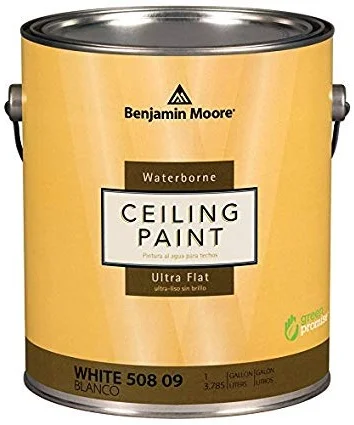
For ceilings, I always use flat paint. Since there is no sheen, it hides imperfections and has a beautiful depth of color. Ceilings tend to be uneven and a flat paint will hide those problem areas and will make the surface look uniform. My absolute favorite product for ceilings is Benjamin Moore Ultra Flat Water Borne Ceiling Paint. It provides a flawless finish and is the flattest finish offered by Benjamin Moore. It is Zero VOC and Engineered with Gennex® Color Technology. Check out my previous post “What’s in Your Paint” for more information on selecting a paint for a healthy home.


Walls
For the walls, I like to use an eggshell finish. It allows for easier clean-ability, but is not too shiny. For walls, I love to use Benjamin Moore Aura in Eggshell finish. It’s a rich and thick paint that provides full coverage, and a beautiful finish with great durability. Good for high traffic areas and it can stand up to repeated washing with no color rub off. It’s a paint and primer in one, mildew resistant, and Zero VOC.
Doors, Baseboards, Trims, Casings, Moldings
I like a satin finish for these wood elements. It’s very durable so it will hold up to normal every day wear and tear. My favorite product for this is Benjamin Moore Aura in a Satin Finish. It’s also great for high traffic areas and it can stand up to repeated washing with no color rub off. It’s also a paint and primer in one, mildew resistant, and Zero VOC.
Bathrooms
Painting a bathroom can be tricky, especially if you don’t want to use a glossy finish everywhere to avoid mildew! Benjamin Moore has a wonderful line of paint called Aura Bath and Spa in a Matte finish. It’s specially formulated for high humidity environments and is mildew resistant. It can stand up to repeated washing with no color rub off. I use this paint on both ceilings and walls in bathrooms for crisp low sheen look.

Cabinets
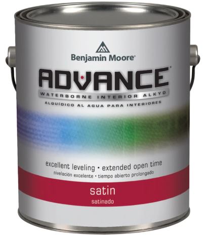
Painting kitchen cabinets is a very technical skill and requires proper preparation. Kitchen cabinets are one of the most commonly touched surfaces and get the most wear. Cabinets must be prepped properly by an experienced painter, primed twice, and then painted. Advance by Benjamin Moore is my “go to” for cabinet painting. As for finish, a paint with some shine is the way to go for durability, so I would avoid Flat paint for this application.
Need More Help with Paint?
Not all paint is the same. Make a conscious effort for your families health by choosing a high quality paint and doing your research on it’s environmental impact. Need help selecting paint colors, finishes, or environmentally friendly products? Schedule a consultation with Sarah Jacquelyn Interiors today! No project too big or small, I love helping my clients specify the perfect paint for their home!

Sherwin-Williams Colormix Forcast 2019
Every year, Sherwin-Williams releases a Colormix Forecast. They take “color of the year” above and beyond, with 6 distinct color palettes that have personality and emotion. After reading about each of them, let me know which palette you feel most connected to!
Every year, Sherwin-Williams releases a Colormix Forecast. They take “color of the year” above and beyond, with 6 distinct color palettes that have personality and emotion. I was able to get a sneak preview of these unique combinations last fall and I’m so excited to share them on my blog today. After reading about each of them, let me know which palette you feel most connected to!
Click below to watch the inspiration video:

SHAPESHIFTER
“There are those who always seem a little ahead of their time. Visionary and creative, this palette reaches into the cosmos and returns with a whole universe of inspiration. Atmospheric wisps of colors, grounded by deep, dark blues, capture the unique space between technology and spirituality.” (swcolorforecast.com)
RINGS OF SATURN | ARTIFICIAL INTELLIGENCE | SPIRITUALISM | HEALING ENERGY


Shapeshifter is all about cool wood tones, iridescent finishes, metals and crystals.

WANDERER
“Some spirits can never be fenced in. They need to soak in the blue of endless horizon and the subtle earthy colors of the high plains and desert. Sun-washed and warm, this palette can be seen in the baked clay canyons, worn leather and woven wool blankets of the true New West.” (swcolorforecast.com)
CAREFREE BOHEMIAN | MODERN COWGIRL | UNBRIDLED ADVENTURE | SOUTHWESTERN TWIST


Picture warm wool blankets, rustic warm wood tones, camel colored leathers. Think lots of natural materials, and sustainable living, the modern farm house. This palette moves away from the high gloss finishes and metallics.
AFICIONADO
“Devotees of the best in life appreciate the well-worn, the bespoke and the rare. Like a bookcase of leather-bound classics, this polished palette evokes nostalgia and timeless tradition. With copper and gold anchored by merlot and deep, dark gray, these tailored tones make everything feel impeccable, tasteful and elegant.” (swcolorforecast.com)
READING NOOKS | BRITISH ACCENTS | TWEEDY MENSWEAR |'60S NOSTALGIA


Aficionado is all about mixing and matching styles and eras. Think warm modernism that is comfortable, yet contemporary. The epitome of the bibliophile.

ENTHUSIAST
“There are those who don’t know the meaning of “less is more.” Passionate and eclectic, they have a calling to be unique. They embrace the details and create scene-stealing worlds that burst with beauty. The proof is in this palette that features bold pops of vivid color, maximum impact and lots of energy.” (swcolorforecast.com)
MAXIMALISM | COZY CHAOS | OVER-THE-TOP OPULENCE | MORE IS MORE


Maximalism is on its’ way back! Think confident, bright colors that celebrate personality and self expression. Layered collages, mixed patterns and textures, and unique wood finishes set this palette apart.

NATURALIST
“Walking barefoot in the garden, nature lovers instantly connect with the wonder of the world in full bloom. With roots in the forest, this palette’s colorful tendrils grew in hothouses and conservatories until they became these lush, sophisticated tones. Ranging from mushroom to leafy green to passionate floral pink, they’ve now found a place where they’ll never fade.” (swcolorforecast.com)
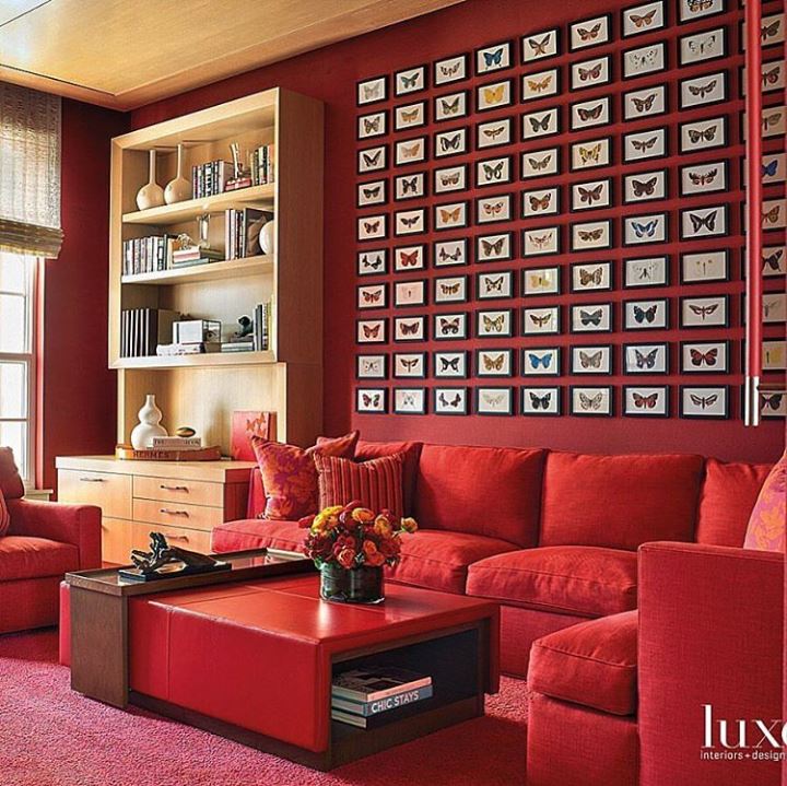
FOREST MUSHROOMS | BOTANICAL PRINTS | BUTTERFLY COLLECTIONS | TERRARIUMS


Botanicals, terrariums, and intricate details, Naturalist is about bringing the outside in. Characterized by worn wood textures and layered plants, this palette is whimsical, yet crisp.

RACONTEUR
“From ancient sagas to today’s motivational speakers, we love our storytellers. With colorful accounts they sum up our very nature and remind us how we’re all connected. Passed from grandmothers, traders and nomads, the tales traveled the world, gaining artistry, until we’ve translated them into a rich and modern palette that spans space and time.” (swcolorforecast.com)
DESERT OASES | GLOBAL STYLE | LUXURY SAFARIS | SPICE MARKETS

Raconteur means story teller. Characterized by global influences and natural materials, this palette captures our attention and connects us through a design story.
